Excel Data Cleaning: Split name column into First and Last at comma

So my wife works at a high school and had an issue trying to upload an Excel file to a database. She asked me if I could look at the file and fix any errors.

**Note the names below have been completely made up, these are not real students. I have not and would not share any private information on my site

You can download the file below to play along:

Okay, so the database she is trying to upload the file too has request the following columns:

ID > Last_Name > First_Name > Grade > Email

**For my non US readers, in the United States we commonly refer to the year you are in school as the grade, so Grade 12 is the final year for high school students.

First thing first, lets split our Student column into first and last name

  1. Let’s make some space, right click grade column and click insert to add a new column

Now, click on student column, select Data from the menu bar, and Text to Columns from the Ribbon bar

Note all the names are different lengths and some students have two last names, while others have a first and middle name. So our best bet is to split this by the delimiter (in this case the comma)

Select comma from the choices, you will see your data preview window what the results will look like

I don’t need to convert data types, so I just ignore this window > Hit Finish

Now all you have to do is change the column names

Next, lets check for bad email addresses. One good thing about email addresses in a single organization is they are often all the same after the @ sign, so we can use the RIGHT() function to count backwards

A quick count of characters (make sure to include the period and @) tells me that starting from the end of the email address, there are 11 characters up to and including the @

So my formula would be =right(E2,11)

With this nice short file, it is easy to see that the forth student has a mistake in his email address.

In the real world, where you have 100’s or even 1000’s of students in a school, it might be easier to use an IF statement to more easily tease out bad emails. Using the code below, we have nested our Right() function inside an IF statement. And we will return 0 for all good emails, 1 for a bad one

=IF(Right(E2,11)=”@school.edu”,0,1)

Even with long lists, the 1 usually jumps off the page against the rows and rows of 0s

Finally, files can some times have spaces before or after data in the cells, and this can mess up an upload to a database sometimes.

We can simply use the Trim function to get rid of extra whitespace.

Run Trim in a new column > Then right click and copy the whole column

Go back to your original column > Paste > Paste Special…>Paste Values (the blue arrow). That will paste just the data trimmed of whitespace, not the formula.

Once you are done, delete the added columns you were working with for the IF() and Trim() statements, make sure your columns are properly named, and you are good to go.

Excel: Create a Grade Book

One of the best ways to use a tool like Excel is to build out a project. In this example I will be using Excel to build a simple grade book for tracking grades in a class. I’ll be using some simple formulas and doing a bit of formatting to make it look good.

Let’s start by creating a list of assignments. For this class we will have 4 Homework Assignments, 3 Quizzes and 2 Exams:

Next, let’s get some students:

Now let’s get some grades. You can input them all manually or we can use the randbetween() function to fill them in.

For Homework, lets imagine each assignment is worth 20 points. So we can run the formula =randbetween(0,20) and drag it across to fill all the HW cells:

Now, left like this, the cells will constantly update with new random numbers. If you don’t want that > copy the cells> paste values

Let’s repeat this process for Quizzes and Tests. Make Quizzes worth 50 point, and Exams worth 100

Now lets calculate the grades:

For Homework, the formula will be simple, add up the 4 grades, divide by total point possible (80). This will give you the percentage in decimal form.

To make this more readable, let’s add a new column call HW_Total

Repeat for Quizzes and Exams (remembers quizzes are out of 50 points, and Exams are 100 points)

We can reduce the number of decimals showing by using the ribbon bar.

Now, before we create a final grade, lets use Range Naming to make this part easier – if you are not familiar with Named Ranges: Click Here for Lesson

Let’s name HW_Totals HW, Quiz_Total > QZ, Exam_Total > EX

Now, here is where it gets tricky. We want homework grades to be worth 20% of the final grade, quizzes worth 30% and exams worth 50%.

Using named ranges we created we can use the following equation: =HW*.2+QZ*.3+EX*.5

Note once you hit enter, it fills in the grades for all the students

If we want to make this a percentage, we can highlight the grade and click the percentage symbol

Okay, so we have a working grade book, but it isn’t pretty. Lets start by highlighting all the assignment titles, then bolding the text. We can also add some borders


Let’s separate the sections with background colors

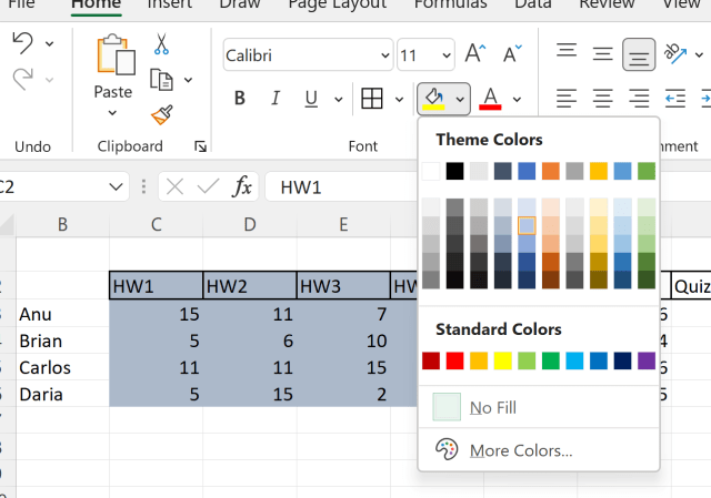
Have fun, try different colors for each section, play with the borders

This is a simple project, but it utilizes many of the skills you will use repeatedly when working with Excel. I look forward to making more advance Excel project tutorials in the future.

Python: Read all files in a folder

os.listdir() command will easily give you a list off all files in a folder.

So for this exercise I created a folder and threw a few files in it.

Using the following code, can iterate through the file list

import os
for files in os.listdir("C:/Users/blars/Documents/test_folder"):
    print(files)

Now if I wanted to read the files, I could use the Pandas command pd.read_excel to read each file in the loop

***Note, I made this folder with only Excel files on purpose for ease of demonstration. You could do this with multiple file types in a folder, it would however require some conditional logic to handle the different file types

To read all the Excel files in the folder:

import pandas as pd
import os

os.chdir('C:/Users/blars/Documents/test_folder')
for files in os.listdir("C:/Users/blars/Documents/test_folder"):
    print(files)
    file = pd.read_excel(files)
    print(file)

R: Importing Excel Files

To work with Excel files in R, you can use the readxl library

install.packages(“readxl”)

Use the read_excel() function to read and Excel workbook

> library(readxl)
>
> ## read excel file
> df1 <- read_excel("r_excel.xlsx")
> head(df1)
# A tibble: 6 x 4
  Name   Job              Hours Complete
  <chr>  <chr>            <dbl> <chr>  
1 Sally  Predictive Model    1. n      
2 Philip Maintanence        10. n      
3 Tom    Ad-hoc Report      12. y      
4 Bob    SSRS                3. y      
5 Philip Tableau             7. n      
6 Tom    Tableau             9. n

By default, read_excel() reads only the first sheet in the Excel file. To read other sheets using the sheet key word.

> ## read  sheet 2
> df2 <- read_excel("r_excel.xlsx", sheet =2)
> head(df2)

# A tibble: 6 x 2
  Animal Num_Legs
  <chr>     <dbl>
1 Dog          4.
2 Duck         2.
3 Snake        0.
4 Horse        4.
5 Spider       8.
6 Human        2.

The next example, we are reading range B2 – C6 on sheet 1 (same as Excel’s range function)

> ## read sheet 1, range B2 - C6
> df3 <- read_excel("r_excel.xlsx", sheet =1, range = "B2:C6")
> df3
# A tibble: 4 x 2
  `Predictive Model`   `1`
  <chr>              <dbl>
1 Maintanence          10.
2 Ad-hoc Report        12.
3 SSRS                  3.
4 Tableau               7.

In this last example, we are importing only the first 4 rows on sheet 2

> ## read sheet 2, first 4 rows only
> df4 <- read_excel("r_excel.xlsx", sheet = 2, n_max = 4)
> df4
# A tibble: 4 x 2
  Animal Num_Legs
  <chr>     <dbl>
1 Dog          4.
2 Duck         2.
3 Snake        0.
4 Horse        4.

Excel: Copy, Cut, Paste, and Format Painter

This is a very basic introduction into Excel. I am going to start with the upper left hand corner of the Ribbon bar: the Clipboard region.

2016-12-18_15-35-08.jpg

While I am aware most of you already know how to use these features, my website is for everyone, including the most base beginner. I remember the frustration of learning the fundamentals of analytics from websites that assumed I already had a PhD and 10 years of work experience in the area.

So feel free to skip this, or take a few minutes to read through, you might be surprised. There may be some tricks in this little corner of Excel you were not aware of.

Cut, Copy, and Past

These 3 features are ambiguous with computer use dating back to days DOS. As a matter of fact, the old keyboard shortcuts used back then still work.

Cut (Ctrl-X) – deletes the highlighted text and stores it in local memory (a clipboard)

Copy (Ctrl-C) – leaves highlighted text as is, but saves a copy of it into local memory

Paste(Ctrl-V) – pastes the contents of the clipboard into the spot you have chosen.

Below are two examples

CUT

Start by highlight the rows A:1 -A:4, click Cut (or Ctrl-X). Now Select Cell C1. Click Paste (or Ctrl-V). Notice column A is now empty.

COPY

Start by highlight the rows A:1 -A:4, click Copy (or Ctrl-C). Now Select Cell C1. Click Paste (or Ctrl-V). Notice Column C is now a Copy of Column A

Clipboard

If you click on the bottom right of the Clipboard box, the clipboard window opens up, showing your the current contents saved to the clipboard

2016-12-18_17-37-39

So now if I add some letters to column B and copy it, that will end up in the Clipboard as well. Notice the original data is still in the clipboard

2016-12-18_17-42-08.jpg

Now when you want to paste, you can choose which item in the clipboard to paste. Without using the clipboard, Excel will paste the most recent item added to the clipboard by default.

2016-12-18_17-40-38.jpg

Copy as Picture

You might notice a drop down arrow next to Copy in the Ribbon Bar. If you click on it, you will see Copy as Picture as an option. This is great when working with Charts. This saves the data as a picture or bitmap so when you paste it elsewhere it will not be affected by changes to the source data.

What I mean by that is, looking at the chart below, column b has a value of 2. If I change that 2 to a 4 in the data table this chart was created from the bar representing b would change to 4 (so would any copied charts). But a chart copied “as picture” would not change. Imagine it to be like a screen shot.

2016-12-18_17-47-52.jpg

Paste Special

Notice the options below Paste when you hit the drop down arrow. Some of the more popularly used are Transpose (turns a vertical list to horizontal list and vise versa). Another popular option is to paste “values”. This is useful when trying to copy a calculated value where all you want is the number (not the formula who made it).

2016-12-18_20-34-34.jpg

Format Painter

Format Painter can help you repeat text and color formatting with just a few clicks

Start by adding color and font bolding to a set of cells. Highlight those cells and click Format Painter

2016-12-18_20-40-38

You will now see your cursor is paint brush. Find a target you want to duplicate your formatting to and click on it.

2016-12-18_20-41-03

And now it looks the same.

2016-12-18_20-41-19


Excel: Data Transformations

Data Transformations

In statistics, data transformations are used, for lack of better words, to even out the numbers. While there are lots of reasons to perform transformations in the world of Statistics, in Data Science and Analytics, our main concern is to bring distributions to the normal form (the classic bell curve).

normal-curve

As with many concepts, sometimes it is easy to see by doing. So let’s jump into Excel, you can download the file to play along here: transform1

First things first – Install Analysis Toolkit

In order to created histograms in Excel (which we will need for this exercise), you need to install the Analysis Toolkit.

Click on the green “File” in the upper left corner of Excel, then click options.

transform

Click Add-Ins > select Analysis TookPak

transform1.jpg

Hit OK and now lets look at our data.

The Data

We have two columns –

UNITSF =10,000 records of house square footage

Bins = list of Bin sizes we will use for the histogram

transform3

First we will create a histogram to look at the data.

To do so, go to the Data tab in the Ribbon bar. Then on the far right select Data Analysis

tranform4.png

Select Histogram

transform5.png

For Input Range – select number values from the UNITSF column.

Bin Range – select number values from Bin column

transform6

Now you get a Frequency Distribution. Let’s visualize it to see better.

transform7.png

In the Ribbon Bar, select Insert>Recommended Charts

transform8

Select the Frequency bar chart

transform9.png

Look at this Frequency distribution. Notice how it bunched to the left. In Stats – they call this Right-Skewed since the long tail trails out to the right.

transform10.png

The problem is, many popular data mining (machine-learning) algorithms can be easily thrown off by data like this. The algorithms (like regressions, decision trees, boosted forests, naive bayes, etc.) are designed to work better with normal distributions.

So to normalize this distribution, we have to transform the data. What that means in practice is to apply a mathematical operation to all the data in the column. Operations like: logs, square roots, cube roots, squaring, cubing, etc.

In our example, the natural log does a very good job of transforming our data.

To do so, lets start by applying the natural log to the first element in our data.

=ln(A2)

transform11

Now hover over the little green box in the bottom corner until your cursor turns into a black plus sign. Double click and the natural log will be applied to all elements.

transform12

Build a new bin column ranging from 3 – 11 by .5

transform13.png

Now lets build our frequency table. Data> Data Analysis > Histogram

Make sure you select the B column for Input and E column for Bin Range

transform14.png

Now go to your new distribution and graph it like we did before.

Notice how the new distribution looks a lot more like the class bell curve.

tranform15.png


Excel: Adjusting Named Ranges

Okay, so you created a spreadsheet. To make it easier for your fellow coworkers to use, you implemented range names. And it all works great, that is until you need to change the actual range.

Look at this example. I had created range call Class which spanned across 16 cells representing 16 classes being offered. It worked great until my boss informs me that my school will now be offering 20 classes.

You can download the Excel file here: ClassChoice

rangeAdj4.jpg

How do you change the range to include classes 17-20?

In the Formulas tab of the Ribbon, you will find an icon called Name Manager 

rangeAdj.jpg

Highlight the named range you are working with  – (in our case – Class)

Double click

rangeAdj1.jpg

Click on the little box to the right of the Refers to: box

rangeAdj2.jpg

Now highlight the new range

rangeAdj3

Click OK and OK. Now your range should contain your new cells.

Linear Optimization Model: Binary Constraints

Today we are going to build a Linear Optimization Model with binary constraints. What that means is that some of our decision variables are going to be restricted to 0 or 1 as possibilities.

This example is more complicated than earlier lessons, so I have included a fully filled out Excel file for you to follow along with. You can download the Excel file here: ModelBuild

Let’s start with the problem:

You have been hired by a company that builds airplane model kits. They currently produce 5 types of models – F-16’s, F-18’s, A-10’s, B-2’s, and B-52’s. They want you to help them maximize their profits.

They have provided you with the following production information.

The Minimum production may need a little explanation. Setting up the equipment to build a particular model has an expense built in. To cover that expense, you need to commit to building at least the value found in the minimum production row. If you can’t meet this level of production, we are not going to build any of this model.

binary1.jpg

We have also been given our available resources:

binary2.jpg

So now on to our decision variables. For each model, we have to first decide whether or not to produce. Remember, if we can’t produce our minimum amount for a particular model, we can’t produce any of that model.

So our Produce? decision variables are going to be either 1 (produce) or 0 (don’t produce)

binary3.jpg

Now our Minimum production row is a simple formula= Minimum production from row 7 above * your 1 or 0 from Produce?  I have placed a 1 in the first column of our Produce? row to demonstrate below.

binary4

Skip Units produced for now. Look at Maximum produced. This formula is simply the 1 or 0 from our Produce? row * 9999. I choose 9999 at random as I know we will never exceed this limit in our example. In other models, you may need a larger number.

Now Units produced is our second decision variable. This variable needs to sit in between Minimum production and Maximum production.

Note that if our Produce? variable is 0 (don’t build) Maximum production will be 0 (Produce? * 9999= 0) . Since Units produced needs to be less than or equal to Maximum production, we cannot produce any units.

Second, since if we decide to build (1), our Minimum production will come from our given values in blue. So our Units produced will need to be greater than or equal to the Minimum production.


Now lets set our Resource used using SUMPRODUCT()

Press Time

binary9.jpg

Grams Plastic

binary10

Finally, we need to set our Result cell – We do this using Sumproduct()

binary5.jpg

Now we can set up our solver.

  • Objective – Profit cell
  • Changing cells – our pink rows – note you separate the two rows with a comma
  • Set our Produce? row to binary (see second picture below)
  • Set Units produced to >= Minimum production
  • Set Units produced to <= Maximum production
  • Set Press Time Resource used <= Resource available
  • Set Grams Plastic Resource used <= Resource available

binary6

binary7.jpg


Finally make sure you are set to Simplex LP and hit Solve

binary8.jpg


Excel: Charts, Customizing Which Columns You Want to Chart

Here is the data set if you want to play along: ExcelCharts2

While Excel does a pretty good job of auto-formatting charts based on your data, sometimes a little customization work is in order. Take this data below for example:

What if I want to create a bar chart of the average readings?

chart1.jpg

Well first we need to make an “Average” column

chart2.jpg

chart3.jpg

I really don’t need all the decimal places. Hit the decimal reduce button in the picture below until you have a column full of integers.

chart4.jpg

Chart Method 1

Just like you would normally, select all the data and go to Insert > Column Chart

chart5.jpg

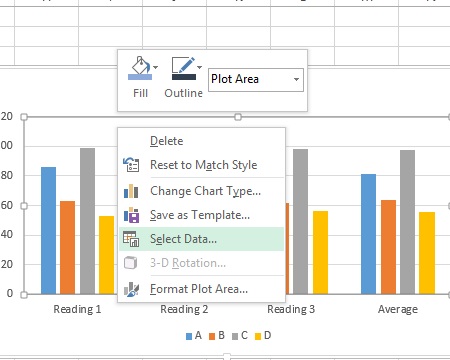
Right Click on your new chart and Select Data…

chart6.jpg

I don’t want my readings on the X axis, I want my Sensor Names, so click Switch Row/Column in the new window.

chart7.jpg

The X Axis is now A,B,C,D

chart8.jpg

Now, we only want to see the Average  column, so uncheck Reading 1,2,3 

chart9.jpg

Here is our chart

chart10

Chart Method 2

Don’t select any data yet. Just go to the Insert and Select Column Chart

chart11

Click Select Data now from the Ribbon (if you don’t see this, click anywhere on your new blank chart and this should appear in the Ribbon)

chart12

Click Add in the low left box.

chart13.jpg

In Series Name, either type a name or select the column header

chart14.jpg

In Series values: put put your data rows from the Average  column

chart15.jpg

Now we have data loaded into our chart, let’s change the data labels for our X Axis. In the Horizontal(Category) Axis Labels –  click Edit

chart16.jpg

Highlight A,B,C,D from the Sensor column

chart17

Now you see the numbers have been replaced by A,B,C,D

chart18

Here is our chart

chart19.jpg


Excel: Randomly Select Names from a List

One of the main elements of statistical analysis is making sure your data is a good representation of the population. The best way to do that is to make sure your sampled data is truly randomly selected.

I am going to show a quick method in Excel where we can select random names from a list (our population) of names. We will be using the following Excel functions to do so (if you are not familiar with them, don’t worry, I will walk you through it):

  • index()
  • randbetween()

We will also be creating a Named Range.

The List

Let’s start with the list. I have 14 names, and I want to randomly select 5 names from this list.

randName.jpg

Index()

Index is a method for using the looking up elements in Excel using the indexes (row numbers, column numbers). Note the index is always a number, so when dealing with columns, don’t be tricked by the column letters assigned.

Here I am looking for the 5th index in my list of names

=index(list,index)

randName2.jpg

My result is Steve

randName3.jpg

You can also work horizontally. Here I am looking for index 3 from my horizontal list.

randName4.jpg

Result is d

randName5.jpg

Now watch this. I am asking for the 4th index in this list. What do you think it will be? The 4th row is Tyrone.

randName6.jpg

Nope, when running INDEX() the index starts at 1 – starting at the first element in the selected list. If you start counting with Gary, Karen is our 4th person down.

randName7.jpg

RANDBETWEEN()

RANDBETWEEN accepts 2 arguments, high and low numbers in a range. It then returns a random integer from with the range.

RANDBETWEEN(1,20) will return an integer from 1 to 20 (including 1 and 20)

Named Range

Now before me move forward, when formulas start to get larger (as they are about to) I look for ways to simplify the syntax.  One trick would be to name our range.

Highlight all the names in your list, then go up to the name box and enter Names

randName1.jpg

Now combine RANDBETWEEN() and INDEX()

now try this: =INDEX(Names, RANDBETWEEN(1,14))

randName8.jpg

Hit enter and drag the formula down 5 cells

randName9.jpg

Now you have 5 random names selected from your list.