SAS is a data based system. It is not much use if you can’t get data into it. In the following exercises, I will show you how to import common data files.
You can download some practice data files here: examplefiles
This is a zip file. Unzip the folder and copy the contents (three files) into a place of your choosing. Now open up SAS Studio:
Select MyFolders on the left pain and select the upload files icon
Now select Choose Files
Your files should now be located under My Folders
Import Txt
If you double click on mileage.txt in the left panel, a preview of the data will pop up.
Now to import this information into SAS, we use the following code.
DATA mileage;
INFILE '/folders/myfolders/mileage.txt';
INPUT year miles;
RUN;
DATA – names your data set
INFILE choose data source
INPUT – names variables(columns)
Now click the Run icon
Now check your results, you data is loaded.
A quick note, SAS chooses a single space as the default delimiter. If your file has a different delimiter like comma.
SAS is a dominant force in the world of analytics. While some may argue it is on its way out, a quick query of current Data Scientist job listing in the NYC area shows many companies are still looking for SAS experience.
Luckily for us, SAS has a free University Edition that we can work with to learn SAS for free.
You can Google SAS University Edition or follow the link below:
First you will need to download and install VirtualBox, you can download it from the SAS page. They have a link.
Next download the SAS OVA package
Once downloaded, just double click on the OVA file and it should automatically install itself into VirtualBox. Note – you must have VirtualBox installed first.
Now, before we can start, you have to make a shared folder on our computer. I just created the following in on my PC. C:\SasUniversity\Myfolders
Now start VirtualBox: Go to SAS University Edition
Right click and click Settings
Now select Shared Folders – click the blue folder with the green plus sign on the right
Type in the path of your folder, the name of your folder and check Auto-mount and Make Permanent
Close the Setting window out and double click on SAS University Edition to get it started.
Once it fully loads, you will get a screen like this
Type the path given into a browser on your machine.
Here is SAS Studio. The Left panel of the screen manages folders and other admin tasks. The right panel is where we type our code. We are going to start with a very simple task of creating a small data set of car names, # of cylinders, and # of doors.
Here is the code, I will explain below the picture.
Now to breakdown the code (note the ; (semicolon) at the end of each line)
DATA cars; -- this names our data set
INPUT NAME$ CYLINDERS DOORS; -- names our variables (or columns if you
will) note the $ after NAME - this
indicates NAME is
a string
datalines; -- the data to input into our set will follow below
you may see some people use CARDS; in place of
datalines I believe this dates back to earlier
versions where one told how much memory to associate
to each row. Now they are interchangeable.
Miata 4 2
Sonata 4 4
Corvette 8 2
Mustang 8 2
Civic 4 2
Accord 4 4
Elentra 4 4
; -- end of datalines
RUN; -- run command - like the go in SQL
Now click the Run icon above your code
And view the output – we have created a data set – congrats!!
Having a solid understanding of current public sentiment can be a great tool. When deciding if a new marketing campaign is being met warmly, or if a news release about the CEO is causing customers get angry, people in charge of handling a company’s public image need these answers fast. And in the world of social media, we can get those answers fast. One simple, yet effective, tool for testing the public waters is to run a sentiment analysis.
A sentiment analysis works like this. We take a bunch of tweets about whatever we are looking for (in this example we will be looking at President Obama). We then parse those tweets out into individual words and we count the number of positive words and compare it to the number of negative words.
Now the simplicity of this model misses out on some things. Sarcasm can easily missed. Ex. “Oh GREAT job Obama. Thanks for tanking the country once again”. Our model will count 2 positive words (Great and Thanks) and 1 negative word (tanking) giving us an overall score of positive 1.
There are more complex methods for dealing with the issue above, but you’ll be surprised at how good the system works all by itself. While, yes we are going to misread a few tweets, we have the ability to read thousands of tweets, so the larger volume of data negates the overall effect of the sarcastic ones.
First thing we need to do is go get a list of good and bad words. You could make your own up, but there are plenty of pre-populated lists on the Internet for free. The one I will be using is from the University of Illinois at Chicago. You can find the list here:
Now open the rar file and move the two text files to a folder you can work from.
Next let’s make sure we have the right packages installed. For this we will need, TwitteR, plyr, stringr, and xlsx. If you do not have these packages installed, you can do so using the following code. (just change out TwitteR for whatever package you need to install)
and connect to the Twitter API. If you do not already have a connection set up, check out my lesson on connecting to Twitter: R: Connect to Twitter with R
Okay, so now remember where you stored the text files we just downloaded and set that location as your working directory (wd). Note that we use forward slashes here, even if you are on a Windows box.
scan looks through the text files and pulls words that start with characters and ignores comment lines that start with ;
You should now have 2 lists of positive and negative words.
You can add words to either list using a vector operation. Below I added wtf – a popular Internet abbreviation for What the F@#$@ to the negative words
neg = c(neg, 'wtf')
Okay, now here is the engine that runs our analysis. I have tried to comment on what certain commands you may not recognize do. I have lessons on most features listed here, and will make more lessons on anything missing. If I were to try to explain this step by step, this page would be 10000 lines long and no one would read it.
score.sentiment = function(tweets, pos.words, neg.words)
{
require(plyr)
require(stringr)
scores = laply(tweets, function(tweet, pos.words, neg.words) {
tweet = gsub('https://','',tweet) # removes https://
tweet = gsub('http://','',tweet) # removes http://
tweet=gsub('[^[:graph:]]', ' ',tweet) ## removes graphic characters
#like emoticons
tweet = gsub('[[:punct:]]', '', tweet) # removes punctuation
tweet = gsub('[[:cntrl:]]', '', tweet) # removes control characters
tweet = gsub('\\d+', '', tweet) # removes numbers
tweet=str_replace_all(tweet,"[^[:graph:]]", " ")
tweet = tolower(tweet) # makes all letters lowercase
word.list = str_split(tweet, '\\s+') # splits the tweets by word in a list
words = unlist(word.list) # turns the list into vector
pos.matches = match(words, pos.words) ## returns matching
#values for words from list
neg.matches = match(words, neg.words)
pos.matches = !is.na(pos.matches) ## converts matching values to true of false
neg.matches = !is.na(neg.matches)
score = sum(pos.matches) - sum(neg.matches) # true and false are
#treated as 1 and 0 so they can be added
return(score)
}, pos.words, neg.words )
scores.df = data.frame(score=scores, text=tweets)
return(scores.df)
}
Now let’s get some tweets and analyze them. Note, if your computer is slow or old, you can lower the number of tweets to process. Just change n= to a lower number like 100 or 50
tweets = searchTwitter('Obama',n=2500)
Tweets.text = laply(tweets,function(t)t$getText()) # gets text from Tweets
analysis = score.sentiment(Tweets.text, pos, neg) # calls sentiment function
Now lets look at the results. The quickest method available to us is to simply run a histogram
hist(analysis$score)
My results looks like this
If 0 is completely neutral most people are generally neutral about the president and more people have positives tweets then negatives ones. This is not uncommon for an outgoing president. They generally seem to get a popularity boost after the election is over.
Finally, if you want to save your results, you can export them to excel.
Decision Trees are popular supervised machine learning algorithms. You will often find the abbreviation CART when reading up on decision trees. CART stands for Classification and Regression Trees.
In this example we are going to create a Regression Tree. Meaning we are going to attempt to build a model that can predict a numeric value.
We are going to start by taking a look at the data. In this example we are going to be using the Iris data set native to R. This data set
iris
As you can see, our data has 5 variables – Sepal.Length, Sepal.Width, Petal.Length, Petal.Width, and Species. The first 4 variables refer to measurements of flower parts and the species identifies which species of iris this flower represents.
In the Classification example, we tried to predict the Species of flower. In this example we are going to try to predict the Sepal.Length
In order to build our decision tree, first we need to install the correct package.
install.packages("rpart")
library(rpart)
Next we are going to create our tree. Since we want to predict Sepal.Length – that will be the first element in our fit equation.
Note the method in this model is anova. This means we are going to try to predict a number value. If we were doing a classifier model, the method would be class.
Now let’s plot out our model
plot(fit, uniform=TRUE,
main="Regression Tree for Sepal Length")
text(fit, use.n=TRUE, cex = .6)
Note the splits are marked – like the top split is Petal.Length < 4.25
Also, at the terminating point of each branch, you see and n= . The number following this is the number of elements from the data file that fit at the end of that branch.
While this model actually works out pretty good, one thing to look for is over fitting. A good sign of that would be having a bunch of branches terminating with n values of 1 or 2. This means the model is tuned too much to the test data and when run up against a new set of data it will most likely result in poor predictions.
Of course we can look at some of the numbers if you are so inclined.
Notice the xerror (cross validation error) gets better with each split. That is something you want to look out for. If that number starts to creep up as the splits increase, that is a sign you may want to prune some of the branches. I will show how to do that in another lesson.
To get a better picture of the change in xerror as the splits increase, let’s look at a new visualization
par(mfrow=c(1,2))
rsq.rpart(fit)
This produces 2 charts, 1rst on shows how R-Squared improves as splits increase (remember R-squared gets better as it approaches 1 so this model is improving with each spit)
The second chart shows how xerror decreases with each split. For models that need pruning, you would see the curve starting to go back up as the splits increase. Imagine is split 6 was higher than split 5.
Okay, so finally now that we know the model is good, let’s make a prediction.
Decision Trees are popular supervised machine learning algorithms. You will often find the abbreviation CART when reading up on decision trees. CART stands for Classification and Regression Trees.
In this example we are going to create a Classification Tree. Meaning we are going to attempt to classify our data into one of the (three in this case) classes.
We are going to start by taking a look at the data. In this example we are going to be using the Iris data set native to R. This data set
iris
As you can see, our data has 5 variables – Sepal.Length, Sepal.Width, Petal.Length, Petal.Width, and Species. The first 4 variables refer to measurements of flower parts and the species identifies which species of iris this flower represents. What we are going to attempt to do here is develop a predictive model that will allow us to identify the species of iris based on measurements.
The species we are trying to predict are setosa, virginica, and versicolor. These are our three classes we are trying to classify our data as.
In order to build our decision tree, first we need to install the correct package.
install.packages("rpart")
library(rpart)
Next we are going to create our tree. Since we want to predict Species – that will be the first element in our fit equation.
To understand what the output says, according to our model, if the Pedal.Length is < 2.45 then the flower is classified as setosa. If not, it goes to the next split – Petal Width. If < 1.75 then versicolor, else virginica.
Now, we want to take a look at how good the model is.
printcp(fit)
I am not going to harp too much on the stats here, but lets look down at the table on the bottom. The first row has a CP = 0.50. This means (approx) that the first split reduced the relative error by 0.5. You can see this in the rel error in the second row.
Now the 2nd row CP = 0.44, so the second split improved the rel error in the third row to 0.06.
Now personally, when just trying to get a quick overview of the goodness of the model, I look at the xerror (cross validation error) of the final row. 0.10 is a nice low number.
Okay, now lets make a prediction. Start by creating some test data
R is great programming language when it comes to manipulating data. That is one of the reasons it is so loved by data scientists and statisticians. Being an open source project, R also has the advantage of lots of additional packages that add even more functionality to the language.
The package I am focusing on today is the plyr package. I am just going to barely dip into this package, as I am only go to cover two functions from the package (laply and ldply). I am covering these as I will be using them in a later lesson how to perform sentiment analysis on Twitter data.
First things first though, you need to download the package.
install.packages("plyr")
library(plyr)
The functions
laply takes in a list, applies a function, and exports the results into an array.
ldply takes in a list, applies a function, and exports the results into a dataframe.
The syntax for both is simple enough:
laply(list, function(x){ func.. })
We are going to do a simple example, creating a list of words and passing this list to a function that will count the characters in each string and then we will multiply the result times 2.
#create data
l = list('dog','cat','horse','donkey')
l1 = laply(l, function(x){x1=nchar(x)
x1 = x1*2})
If you now check l1, it will return an array of 6,6,10,12 (disclaimer – since this is a single column array R actually places it into a simple vector)
Now let’s try ldply which return a dataframe ( more useful in my opinion)
l2 = ldply(1, function(x) {x1 =nchar(x)*2})
#add words to l2 dataframe
l2$word <- l
Checking the output of l2 now returns a two column dataframe.
You can do a lot in the way of text analytics with Twitter. But in order to do so, first you need to connect with Twitter.
In order to do so, first you need to set up an account on Twitter and get an API key. Once you have created your account, go to the following website: https://dev.twitter.com/
Once there, click My apps
Click Create New App
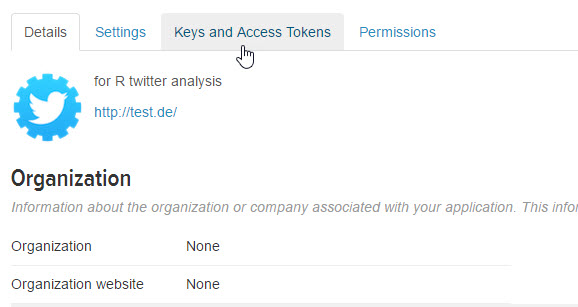
Give name, description (it doesn’t matter – matter anything up), for website I just used http://test.de
Go to Keys and Access Tokens
Get your Consumer Key (API Key), Consumer Secret (API Secret), Access Token, and Access Token Secret
Now open R and install the TwitteR package.
install.packages("twitteR")
Now load the library
library(twitteR)
Next we are going to use the API keys you collected to authorize our connection to the Twitter API (Twitter uses OAuth by the way)
For most HTM professionals, accountancy is not your primary profession. Yet between contracts, capital equipment purchases, and parts spending, many HTM managers are, in effect, running multi-million dollar corporations. With such high dollar items like imaging glassware and ultrasound probes, the potential for fraud runs high. A less than honest employee looking to supplement his or her income can take advantage of chaos often found in a busy shop to help themselves to some high dollar items.
How can you guard yourself against wolves hidden amongst your flock?
The answer may lie in an interesting statistical phenomena known as Benford’s Law, also called the First-Digit Law. Benford’s law has been used by CPAs and fraud investigators to detect abnormalities since the 1930’s.
How does it work?
Imagine I have a bag containing 9 ping pong balls labeled 1 – 9. I ask you to close your eyes, reach into the bag, and pull out a ball. What is the probability you will pull out a 5? Probability theory tells us the answer is 1/9 or approximately 11%. That is because 1 ball out of the 9 in the bag is labeled 5. The same thing applies to any number you choose.
So now we are going to replace the bag of balls with a spreadsheet containing parts purchases over the past year. Looking at the column with purchase prices, I am going to take the first non-zero digit from each row. So if the price is $130.00, I will take 1. If the price is $67.34, I will take 6. Now, I will throw all of those first digits into my imaginary bag, have you reach in blindfolded and pull out a 5.
What do you think the probability was you would pull out a five? 11%? Actually it is 7.8%.
Huh?
I know what you are thinking. I have a bag of random numbers 1-9. Shouldn’t the probability of pulling any digit be 1/9 (11%)? Well not according to Benford’s Law.
Benford’s Law states that first digits taken from an organic set of numbers (i.e. numbers without artificial constraints) will follow the unique distribution seen below.
So the probability of pulling a 1 is 30% while the probability of a 9 is under 5%.
The distribution is calculated using the following formula:
Where the probability (p) of the number in question (n) can be calculated using a logarithm.
While it is a mathematical law, Benford’s Law is a phenomena meaning it is not fully understood how or why it works. The simplest explanation I can offer you involves looking at the following table demonstrating a 10% yearly compounded interest on a $1 investment.
Notice how the first digit stays 1 for 8 years, but only 4 years at 2, and 1 year by the time it reaches 9. If you were to continue through 10’s to 100’s you would notice the same pattern repeating itself.
How can I use this?
Simply enough, take your parts purchasing history, truncate the first non-zero digit and create a histogram of your results. If it does not look like the distribution seen above, that is a good sign something is wrong. People trying to perpetrate fraud will often try to cover their tracks. Human intervention – altering order histories, removing purchases from ledger, will alter the organic nature of your data, and in turn, alter the distribution of your first digits.
While not the perfect catch-all by any means, Benford’s Law is used regularly by CPAs to alert them to possible fraud, book keeping errors, or other accounting irregularities. It is a simple tool which costs nothing to implement and should be part of the toolbox of any manager overseeing high volume spending.