Excel Solver: Intro Optimization Models: Linear

What is an optimization model? An optimization model is a mathematical model designed to provide the optimal solution based on a information provided. You can use it answer questions like the optimal number of employees needed to working a shift or the optimal amount a product to produce that will bring in the most profit.

In this lesson we will be using Excel Solver ( a free ad-on) to develop an optimization model. If you do not have Solver loaded already, follow the instructions below:

Click File Button

adOpt1.jpg

Click Options

adOpt3

Click Add-Ins in the left column, find Solver Add-in. Click Go at the bottom next to Manage: Excel Add-ins

adOpt4.jpg

Check the box next to Solver Add-in – Click Ok and go back to main Excel page

adOpt5

To check that it installed, go to Data on the Ribbon and check for Solver in the Analysis box

adOpt6.jpg

Get the Excel File

You can make the file yourself, or download the template here: AdOptModel

Let’s look at our file:

This is a very simple example to start with. I am looking to run advertisements on a local radio station. The station provides two ad packages A and B. Package A is promised to reach 69,000 potential customers per airing and costs $156 dollars. Package B will reach 79,000 and cost $173.

I want to know how many of each package to run to reach the most customers. My only constraint is that I have a solid budget of  $10,000 that I cannot exceed.

adOpt2.jpg

Now you do not have to use the colors, I just learn this way and it makes sense to me. To understand the coloring:

  • Blue = input cells – you need to provide this information to your model
  • Pink = changing cells. These are the boxes Solver is going to use to try to work the problem out – do not put any formula in these boxes
  • Gray = Result cell – you can only have one result cell.

Build the model

Now we are going to build the model. We need to add some calculations to our existing sheet for the model to work.

Step 1: This step is optional. I always place some number value in my changing cells just to make sure my formulas are inputted  correctly.

adOpt7.jpg

Step 2: Constraint. Our budget is 10000, so we need a cell that calculates how much we are spending based on values in our change cells (Number of each ad we plan on running). To calculate this we are going to use a formula call Sumproduct()

What we want to do is multiply (# of ads for A * cost per Ad A) then add that to (# of ads for B * cost per Ad B)

That is what Sumproduct gives us (B5*B8)+(C5*C8)

adOpt8.jpg

We are going to do the same thing for our Result cell, except this time it will be Number of Ads * Customer Reach

adOpt9.jpg

Use Solver

Now it is time to use Solver, click on solver in the Data Tab of the Ribbon bar (under data analysis).

Let’s walk through this slow. In the top box, Set Objective, set this to the Result Cell. You can type it in or just click on the cell.

In the To: line, select Max since we are looking for the maximum customer reach here

adOpt10.jpg

adOpt11.jpg

Now set your Changing Variable Cells

adOpt12.jpg

To the right of big white box in the middle of the window, select Add

Place our constraint cells in this box.

adOpt13.jpg

Finally, make sure you check Make Unconstrained Variables Non-Negative and set our Solving Method to Simplex LP

Click Solve

adOpt14.jpg

Solver found a solution — Yay

Check – Keep Solver Solution

Hit okay

adOpt15.jpg

Here is our answer. Running 57.80347 Package B ads will get us 4566.474 Customers Reached.

adOpt16.jpg

But how do you run 0.8 of an ad?

Well, this is where we add in an integer constraint.

Reopen solver. Hit the Add button next to constraints

In Cell Reference, put our changing cells.

From the drop down pick “int”

adOpt17.jpg

adOpt18.jpg

Click Ok and run Solver again.

Now look at our new results: 2 of Package A and 56 of Package B

adOpt19.jpg


Excel: Range Names

In Excel, you can name your cells and ranges of cells with more user friendly names. This comes in handy as your spreadsheets become more complex. It also comes in handy when you are sharing spreadsheets between co-workers.

File download available here: checkbook

This file is simple enough. I have an example checkbook with monthly salary and monthly expenses listed.

rangeName1.jpg

Select cell containing the monthly salary(B3). Now go up to the cell name box (circled in red)

rangeName2

Type a new name in the box – I used “Income”

rangeName3.jpg

You can do the same thing with a range. Select cells D3- D5, then rename it “Expenses”

rangeName4

If you check the drop down from the name box, you will see your new named cells in the drop down.

rangeName5

Let’s uses our new named cells (and ranges) to make a quick formula.

rangeName6

rangeName7.jpg

rangeName8.jpg

To see a video of this lesson, click the link here: Excel: Name Ranges

How I Found Love Using Pivot Tables

Okay, a little background information is in order here. I work for a Clinical Engineering Department in a large hospital system. Our main purpose is to inspect and repair medical equipment, from MRIs and CT Scanners down to blood pressure machines and IV pumps.

Now I know the title says love, and I promise there is a love connection, just be patient.

While doing some database work on the system we use to track repairs, I decided to do a little data exploration (I don’t have a lot of hobbies). I asked myself, “What equipment is breaking down the most?” I figured this could be a valuable piece of information. So, I exported six months worth of repair history into a CSV file.

Using Excel, I started playing with Pivot Tables. I started by checking to see what types of equipment seemed to break down the most. Turns out it was infusion pumps, not a real surprise to anyone who has ever worked in the field.

excelpivot2

But looking a little more closely. One hospital out of my system used Brand A and they wanted to get rid of them out of the belief they were the unreliable. However, a quick look at the data provided otherwise.

excelpivot3

Okay, so after I unsullied the reputation of the Brand A pump, I decided “Why not look at the repair rates of individual pieces of equipment?” (I know, I live a WILD life)

Below is the list from one of my hospitals. Pay special attention to the area highlighted in red. The amount of repair work orders opened for dental chairs was way off anything my 20 plus years of experience in the field would have led me to expect.

excelpivot1.jpg

So I decided to dig a little further. Well, it turns out all 78 work orders we opened by one of our younger (24 year old) single technicians. A quick walk up to the dental department quickly explained why the dental chairs needed so much attention. The problem was about 5’2″, long blond hair, a cute smile, and (even in scrubs) quite the little body.

So there you go. Young love revealed itself through the power of the pivot table.

Excel: Sorting and Filtering

Download Exercise File Here: ExcelTable

Sorting and Filtering are two basic functions you will perform quite often in Excel. When dealing with large data sets, it can be difficult to see what you are looking for, especially if the records appear in random order. Using sort and filter, you can adjust the spreadsheet to show what you want to see.

Sort

Sorting is simple in Excel. Just click on the header cell for the column you want to sort (in my example I chose “Name”). From the Ribbon Bar select Data. Now click on the AZ and ZA arrows. The column you selected will sort.

excelsort

Now, try it out on the other columns as well.

Finally, select the box directly above the word sort in the picture above. This will give you an advanced sort menu.

From this menu,  can select the column you wish to sort, the values you want to sort on, and the sort order.

excelsort1.jpg

Filter

To filter, select the Filter icon from the Data tab in the Ribbon Bar

excelsort2

Notice arrows now appear in the column header cells

excelsort3

Click on the arrow for Quarter. Now, uncheck the Select All box and check Quarter 2 > Okay

excelsort4.jpg

Now your sheet only has rows containing Quarter 2. Take note of the row numbers though. Notice the row numbers skip around. This is because the other rows are still there, they are just hidden by the filter.

excelsort5.jpg

Excel: An Introduction

Excel is Microsoft’s spreadsheet program. It is so well known, that for many the words Excel and spreadsheet are used interchangeably.

What is a spreadsheet? A spreadsheet is a computer program that uses columns and rows to store and perform calculations on data.

Notice in Excel, columns are denoted by letters and rows are denoted by numbers. The spaces are called cells. We refer to the cells by their letter and number designation. A1, B1,C2, etc.

excelIntro

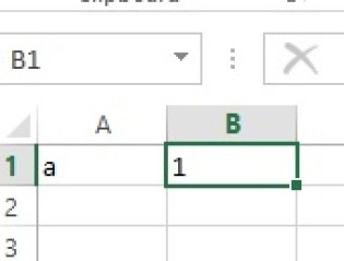
Getting started, just click on A1 and enter “a”. Next click on B1 and enter 1.

Note how “a” hugs the left side of the cell and “1” hugs the right. This is because Excel automatically tries to define the data type in the cell. This this case, “a” is text and 1 is numeric.

excelIntro1

Now right click on the cell holding 1 (B1) and select Format Cells…

excelIntro2

From the pop up window, select Text and click okay. This converts 1 from Number to Text

excelIntro3

Now see how both cells hug the left.

excelIntro4

Cool Tricks

Excel has some cool tricks. I know most intro lessons don’t jump into what I am about to cover, but learning something cool always makes the learning process more fun.

Go to cell A3 and type “Monday”

Now notice the small green box in the bottom right corner of your cell. Click on that box, holding your mouse button key, drag your cursor down to A9

excelIntro5

How cool was that?

excelIntro6

Try it with month names.

excelIntro7

Now, trying it a number is a little different. Try placing 1 in a cell and dragging it down a couple cells. The numbers just repeat themselves.

excelIntro8

To get the numbers to work, type 1,2,3 in 3 consecutive cells.

excelIntro9

Highlight all 3 cells and click on the small green box. Now drag down a few cells and see what happens.

excelIntro10

Excel: Tables

Excel’s Table feature adds some nice functionality to your Excel workbook.

Download exercise file here: ExcelTable

Create Table

To create a table, highlight the cells you want and hit Ctrl-T. Leave My table has headers checked as our first row is header values.

exTab1.jpg

Your table will now look like this:

exTab2.jpg

The drop down menu in each header provides sorting and filtering.

exTab3

Tables provide a new set of menu items in the Ribbon Bar

exTab4

Let’s click the Total Row check box in the Ribbon Bar

exTab5

A Total Row will appear at the bottom of your table. You can select which kind of aggregate you want to perform.

exTab6

Slicer

Let’s add a slicer now.

exTab7.jpg

Select Name

exTab8.jpg

Now you have a slicer for your table.

exTab9

Now, select Charles and see how it filters your table

exTab10

Excel: Scatter Plots

Download worksheet here: ExcelCharts2

Our data set contains 3 sets of readings for 4 sensors (A,B,C,D)

excelCharts1

Scatter Plot

Reading 1

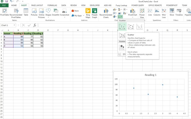
Highlight Columns A and B – From Ribbon > Insert>Scatter

excelCharts2.jpg

Here is a close up of the Scatter Plot icon

excelCharts3.jpg

Here is our plotting of Reading 1

excelCharts4

Reading 2

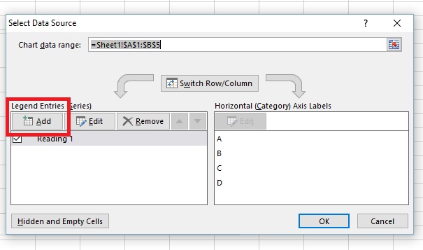
To add the Reading 2 column to the plot, right click on the chart area and Select Data

excelCharts5

Select Add

excelCharts6

  • Select the Heading from Column C for Series Name
  • A2:A5 as Series X values
  • C2:C5 as Series Y values

excelCharts7.jpg

Reading 3

Repeat again for Reading 3

excelCharts8

Now, double click on the Y-Axis and go to the Format Axis box that will appear on your right.

Select the Bar Chart Icon, and change the Axis Bounds to minimum of 40 and max of 100.

excelCharts9.jpg

This will help make the spacing between dots more pronounced. Generally altering a Y Axis away from 0 is considered bad taste as it tends to over-pronounce differences between elements.

excelCharts10

Now click on X-Axis and make the changes below.

excelCharts11

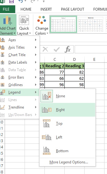
Next, go to Add Chart Element in the upper right corner. Legend>Right

excelCharts12

Here is our scatter plot

excelCharts13

Now wait a minute. I know what you are thinking, why is my X Axis 1 – 4 and not A,B,C,D

This is a flaw in Excel. There are some third party packages you can install that will allow you to rename the X Axis in a XY Scatter plot, but not with Excel in its default state.

You can however change the chart type to a Line Chart.

Go to Ribbon > Change Chart Type

Select Line

excelCharts14

Now your X-Axis is properly labeled

excelCharts15.jpg


Excel: Intro to Charts

Excel makes building basic charts easy.

Download sample data set here: ExcelCharts1

The Data

Our sample data set here is simple enough. We have 5 sensors (A,B,C,D,E) and one reading from each sensor.

excelChart

Column Chart

Let’s start with a column chart. To create a column chart, first select (highlight) your data set and then go to Insert>Column Chart in the Ribbon Bar.

excelChart1

From the column chart options, I am going to pick the first 2D chart option

excelChart2

excelChart3

Once a chart is created, you will notice a new element – Chart Tools – in the Ribbon Bar.

The first thing I want you to explore is Chart Styles. Click on the different options and see what happens.

excelChart4

Next, let’s try changing the colors:

excelChart5.jpg

Now go to Add Chart Element

Go to Axis Titles>Primary Horizontal

excelChart6

Now click on the Axis Title and rename it.

excelChart7

Label this Axis “Sensors”

excelChart8

Now select Primary Vertical and name it “Readings”

excelChart9

Now to change the chart title. Click on the title:

excelChart10

Rename it “Sensor Readings”

excelChart11


If you enjoyed this lesson, click LIKE below, or even better, leave me a COMMENT. 

Follow this link for more Excel content: Excel

Excel: Intro to Pivot Tables

Pivot Tables are a built in feature to Excel that allows for better data analysis. Using Pivot Tables, you can work with aggregates with ease.

Download this Excel file to follow along: studGrades

Let’s look at the data:

This data set represents Grades for 5 students across four quarters.

pivot1

Trying to calculate overall averages for each student or each class would require a lot of work using just straight spreadsheet functions. Pivot Tables make such tasks a breeze though.

Create a Pivot Table

Highlight you data set and go up to the Ribbon Bar > Insert>Pivot Table

pivot2

We are just going to hit OK here. But if you want to know a bit more about the window:

  • Choose the data that you want to analyze: notice the table range is A1 through F20 on the Courses tab. This is our data set.  – Use an external data source lets you grab your data from another program if you want
  • Choose where you want the PivotTable report to be place. – Default New Worksheet opens the table in a new sheet (our option) – Existing Worksheet allows you to place the table on an existing page
  • Choose whether you want to analyze multiple tables – this is more advanced. This lets you take multiple tables and join them together for analysis.

pivot3

After you click okay, Excel opens up your new Pivot Table

pivot4

Average Student Grade for Q1

Drag Stud_ID down to the ROWS box and Q1 down to Values

pivot5

Now we don’t want a Sum, we want an Average. So click on the down arrow by Sum of Q1 in VALUES. Select Value Field Settings…

pivot6

Now select Average and click OK

pivot7

Now you have averages in your table

pivot8

Average grades in classes

To find averages for classes, drag Stud_ID out of ROWS and drag Class into ROWS

pivot9

Now you have average grades for classes.

pivot10

The other 3 quarters

Just drag Q2, Q3, and Q4 into VALUES. Note they will most likely default as SUM, so you will need to change them to Average same way you did above.

pivot11

pivot12


If you enjoyed this lesson, click LIKE below, or even better, leave me a COMMENT. 

Follow this link for more Excel content: Excel

Excel: Data Cleaning

Data cleaning is one of the least enjoyable tasks for data professionals. Unfortunately, most data scientists I have spoken to state that data cleaning makes of 60% to 70% of their work load.

While there is no magic data cleaning machine I am aware of, there are some tips and tricks that you can learn to save you a lot of time and head aches. I have put together a 2 part video series using Excel that shows some of the most common data cleaning tasks:

  • Handling Duplicates
  • Spelling Errors
  • Missing Data
  • Converting Data
  • Merging Data Sets

I even have the Excel worksheet available for download so you can work along with the videos.

Download the file here: Data Cleaning

Videos

Below, you will find the links to my videos (video opens in new tab)

Excel: Data Cleaning with Excel Part 1 

Excel: Data Cleaning with Excel Part 2


If you enjoyed this lesson, click LIKE below, or better yet, leave me a COMMENT. 

Follow this link for more Excel content: Excel