Excel: SUMIF() and COUNTIF()

SUMIF() and COUNTIF()

Download Practice Excel File Here: Conditional Formula

SUMIF()

SumIf is a handy Excel function to have in your tool box. It is basically a combination of SUM() and IF(). What it is saying is, SUM up all numbers in a range that meet certain condition.

The syntax is as follows:

=SUMIF(range, criteria, [sum_range])

Range = range of numbers you want to test the criteria against

Criteria = the logical test (is the data in the range =, >, < a value)

[sum_range] = this is an optional value. It tells Excel which cells to add. If you don’t use this value, Excel automatic defaults to the first Range

excelSumif

COUNTIF()

CountIF counts the number of cells that meet a certain criteria.

Syntax is similar to SUMIF():

=COUNTIF(range, criteria)

** Note this example uses wildcards – symbols that can be used in place of any symbol. In Excel, the two most popular wildcards are * and ?. ? can be used in place of one character (B?d = Bad, but B?d <> Bead). * can be used in place of many characters. B* = Brain and B*d = Bead)

excelcountif

Intro to Tableau: Line Chart: 3 or More Measures


 Note:

If you do not currently have Tableau, you can download a free version at: https://public.tableau.com/s/

Downloads:

Download Practice Excel File Here: School Lunch


Line Chart: 3 or More Measures

This lesson is a continuation of an earlier lesson. If you are already familiar with Tableau, feel free to continue on. Otherwise, check out my first Tableau lesson: Line and Bar Charts

If you want to add 3 or more measures to a line chart, you need to take a different approach than in regular charts.

Import the Data

Select Excel from the Connect menu and select the school lunch excel file you have downloaded.

If you are continuing on from the Line and Bar Charts lesson, you can skip this step, your data is already loaded.

tableauIntro1

Create a New Worksheet

Click the New Worksheet icon found on the bottom of your screen.

tableauIntro3

Drag Year to Columns and Measure Values to Rows

tableau3ormorel1

  1. Get rid of Sum(Number of Records) by dragging it back into Measures
  2. While holding down Ctrl drag Measure Names from the Dimensions slot to Color

tableau3ormorel2

And there you have it. 3 Measures in one chart.

tableau3ormorel3


Excel: =If() – Conditional Formulas

=If()

Download Practice Excel File Here: Conditional Formula

Conditional formulas can really up your Excel game. This can provide a lot more functionality to your workbooks.

So what are conditional formulas? Conditional formulas work based on the following logic: IF condition THEN action.

examples: IF gas tank is low THEN  go to gas station

IF age > or = to 21 THEN you can drink

The basic Excel formula for this is =If()

Syntax

=If(logical test,[value if true],[value if false])

Example 1

In the first example, we are going to see if a value in Column A is > 10. If it is, we will return High. If not, it will return Low.

excelIf1

It also works with strings.

Example 2

In this example, we are asking if any name in column D matches Bob, then Yes, else No.

excelIf2


Intro to Tableau: Dual Axis Charts


 Note:

If you do not currently have Tableau, you can download a free version at: https://public.tableau.com/s/

Downloads:

Download Practice Excel File Here: School Lunch


Dual Axis Charts

This lesson is a continuation of an earlier lesson. If you are already familiar with Tableau, feel free to continue on. Otherwise, check out my first Tableau lesson: Line and Bar Charts

Import the Data

Select Excel from the Connect menu and select the school lunch excel file you have downloaded.

If you are continuing on from the Line and Bar Charts lesson, you can skip this step, your data is already loaded.

tableauIntro1

Create a New Worksheet

Click the New Worksheet icon found on the bottom of your screen.

tableauDual1

Drag Year from Dimensions and Free from Measures into Columns and Rows respectively. You should now have a line chart. (if not, refer to Lesson 1 for troubleshooting tips)

tableauintro4

Now, drag Full Price into Rows. You should now notice you have two graphs. Free up top and Full Price on the bottom.

tableaudual2

Now you could just stop there. You do have both Measures graphed. But this really isn’t the best way analyze this data. It is hard to do a good comparison this way.

Dual Axis

For better analysis, we are going to create a Dual Axis Chart.

Right click on the Y Axis of the bottom chart and select Dual axis

tableaudual3

Now you have both measures on one graph.

tableaudual4

If you look closely at the Left and Right Y-Axis’s, you will notice they are not the same. This could skew how someone would interpret this data.

To fix this, right click on the Right Y-Axis and select Synchronize axis

tableaudual5

Finally, since both of your Y-Axis match up, you don’t need them both. Right click on the Right Axis again and uncheck Show header.

Previous > Lesson 1

Next > 3 or More Measures


Intro to Tableau: Line and Bar Charts


 Note:

If you do not currently have Tableau, you can download a free version at: https://public.tableau.com/s/

Downloads:

Download Practice Excel File Here: School Lunch


Lines and Bar Charts

Start Tableau

When you start up Tableau, the first thing you need to do is select a data source.

tableauIntro1

In this case, select Excel and choose the file the you downloaded above (schoolLunch.xls)

Once loaded, the Data Source Page will open up.

a. Data Source File

b. Shows Sheets in the file (there is only one sheet in this particular file)

c. Shows data.

tableauIntro2

The Data

In this example, we are looking at the number of kids receiving Free, Reduced Priced, and Full Price lunches at American public schools from 1971 to 2015.

Line Chart

Start by making a new sheet

tableauIntro3

A Quick Note About Dimensions and Measures:

Notice on the new sheet that the columns from your imported Excel sheet have been placed into two boxes on the left of the screen: Dimension and Measures. Think of Dimensions as Factors or Labels. While Measures are columns you would perform calculations against (adding, averaging, etc). 

Drag Year from Dimensions and Free from Measures into Columns and Rows respectively.

tableauintro4

The line graph should appear automatically. If not, follow the next steps:

First, make sure your Row variable says SUM(Free)this means we are summing up all numbers in the Free column— If it doesn’t, hover over the measure until a small downward arrow appears. Then go to Measure and select Sum.

tableauIntro5

If you don’t have a line chart, go to Marks and select Line from the drop down menu

tableauIntro6

Bar Chart

Now, go to Marks again and select Bar. Your chart will change over to a bar chart. Try a few of the other options like Area and Shape.

tableauIntro7

Next Lesson: Dual Axis Charts


Power Query: Pull data from a website into Excel

For this tutorial, you will need to have Power Query installed. If you are running Office 2016, Power Query should already be available. For Excel 2010 and 2013, here is a link to the download: Power Query

Power Query makes pulling data from a website quick and easy. In this example we will be extracting data from the Wikipedia page “List of NCAA Men’s Division I Basketball champions“. Here is a link to the website: Link to Wikipedia Site

If you open up the Wikipedia page and scroll down a bit, you will see a table:  Championship games, by year, showing winners and losers, final scores and venues. This the table we will be extracting into Excel.

powerQuery-web.jpg

  1. Open up a new Excel workbook. Locate the Power Query Tab on the Ribbon Bar
  2. Select Web Page
  3. In the pop up window, copy and paste the URL to the Wikipedia Page
  4.  Click Ok

powerQuery-web1

5. Notice as you click through the list of tables on the left side of the screen, the tables             appear in the preview screen on the right.

6. Select Championship games, by year….

7. Click Load 

powerQuery-web2.jpg

Congratulations. You now have the table from the Web in an Excel sheet.

powerQuery-web3


Power Query: Merge Data Sets

For this tutorial, you will need to have Power Query installed. If you are running Office 2016, Power Query should already be available. For Excel 2010 and 2013, here is a link to the download: Power Query

Here is a link to the practice file for this Lesson: Data Cleaning Power Query

If you open the Excel file, you will see 3 sheets with 3 tables (Work Order, Vehicles, Prices). We want to populate a single sheet combining the three tables into one data set.

datacleanPowerQuery

Open up a New Excel Workbook (A new file. Do not try working from the practice file). From the Ribbon bar select Power Query > From File > From Excel

datacleanpowerquery1

Select the practice file: dataCleaningPQuery.xlsx and when the Navigator pops up, select Work Orders

datacleanpowerquery2

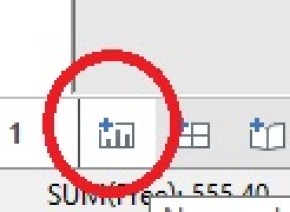
Select Load. Once the work order loads, repeat the process, this time loading Prices.

**Note if the Query Editor window pops up, just click Close and Load. We will be working in the Query Editor window later. 

datacleanpowerquery4

Now go to the sheet with the Work Order table on it. Power Query > Merge

datacleanpowerQuery6

A) The top drop down box should already be populated. If not, select Work Orders for top and then select Prices for the bottom.

B) Now highlight the Service Columns in both tables.

C) Leave the Join Kind at Left Outer.

A Left Outer Join works as seen below. The left table is displayed in full and the the right table adds data based on columns that match up against data in the left table.

datacleanPquery

Note the text below “The selection has matched 29 out of the first 29 rows.” This is because if you look at the two columns we selected, they both have matching text. It is through this matching that we are able to line up the two tables into one.

Click OK and the Query Editor window will pop up.

Select the dual arrow icon in the NewColumn header and deselect Service from the list.

datacleanpowerquery8

Right click the NewColumn and Rename it Price. Click on it and hold down the mouse button. Now drag it so that price sits in between Service and Mech.

Hit Close & Load and your new merged table should look like this:

datacleanpowerquery9

Ok, now to load the Vehicle sheet.

Power Query > From File > From Excel. Select excel practice file and select Vehicles. DO NOT HIT LOAD this time. Instead, select Edit.

datacleanpowerquery10

If you look at the original data set, the Lic Plate column in the Work Order sheet and Licence Plate in Vehicles are the two column we need to match up. Unfortunately, they currently do not match. In the second table, the licence plates are preceded by the letters Lic. We need to remove this.

Right click on the Licence Plate> Replace Values

datacleanpowerquery11

Type Lic  into Value to  Find and leave Replace with blank. **Note — the Value to Find is “Lic ” with a space after it. Make sure you add the space.

datacleanpowerquery12

Click OK, the Licence Plate column will remove the Lic. Click Close & Load

Now it is time to merge. Go back to the Work Order sheet and click Merge

Set the top table to Work Orders. Set the bottom to Vehicles. Highlight Lic Plates and Licence Plate columns. Set Join to Left Outer Join and click okay.

datacleanpowerquery13

Click the double arrows on the new column and un-check column 1.

Rename the new columns Make and Model. Highlight both column and move them in between Lic Plate and Service. Click Close&Load

datacleanpowerquery15

Congratulations. You have now successfully merged 3 tables into 1 using Power Query. Now you can go forth and analyze the data.


Tableau: CPI Food Prices 2013-2015

cpifood

This visualization (made using Tableau) shows the CPI (Consumer Price Index) for common food items. While 2014 was bad year for staples such as dairy and meat, 2015 showed a nice recovery. The main exception being eggs. Look at the massive increase in egg prices caused by the bird flu epidemic of 2015.  **note the purple dot represents the 20-Year Historical Average.

Link to Tableau workbook: Workbook

Data found at USDA website: data link

HTM: Visualizing Inspection Schedule Balancing

PM’s can be a real resource drain, especially on the heavy months. That has been one thing that has always confounded me as long as I have worked as an HTM professional (or Biomed  — the name keeps changing). I have never understood why you would have one month with over 1000 scheduled inspections and only 200 scheduled inspections in another month.

The problem is, balancing the workload is a tedious job, sifting through pages of work order lists and moving schedules around. However, if you don’t feel like going cross eyed staring at all of that small text, try giving data visualization a try.

pmSchedule

This graph above(produced using Tableau) shows the scheduled work order load for an imaginary hospital. Note that each color block represents a separate department.

pmSchedule1

Mousing over each colored block provides a fly out showing the Department and record count. You can go here to try the interactive visualization out for yourself: Click here to interact

Looking at this visualization, it is easy to see where departments can be quickly moved around to balance the load. This visualization, if connected to your database, can also become part of a dashboard – allowing you to keep an eye on the work load and prevent it from become unbalanced as departments open and closed and equipment comes and goes.

Now the final data model I created takes more into account than simply the number of records. Using historical data, I add a timing factor to each inspection (this takes into account that the inspection of a diagnostic ultrasound machine will take more time than the inspection of an IV pump). I also add in a personnel factor (if you only have one technician qualified to work on imaging equipment vs 8 technicians for standard patient care equipment, the imaging technician’s time should be weighted to represent that).