
Note:
If you do not currently have Tableau, you can download a free version at: https://public.tableau.com/s/
Downloads:
Download Practice Excel File Here: School Lunch
Dual Axis Charts
This lesson is a continuation of an earlier lesson. If you are already familiar with Tableau, feel free to continue on. Otherwise, check out my first Tableau lesson: Line and Bar Charts
Import the Data
Select Excel from the Connect menu and select the school lunch excel file you have downloaded.
If you are continuing on from the Line and Bar Charts lesson, you can skip this step, your data is already loaded.

Create a New Worksheet
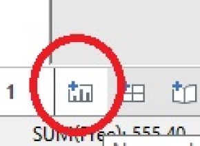
Click the New Worksheet icon found on the bottom of your screen.
Drag Year from Dimensions and Free from Measures into Columns and Rows respectively. You should now have a line chart. (if not, refer to Lesson 1 for troubleshooting tips)

Now, drag Full Price into Rows. You should now notice you have two graphs. Free up top and Full Price on the bottom.

Now you could just stop there. You do have both Measures graphed. But this really isn’t the best way analyze this data. It is hard to do a good comparison this way.
Dual Axis
For better analysis, we are going to create a Dual Axis Chart.
Right click on the Y Axis of the bottom chart and select Dual axis

Now you have both measures on one graph.

If you look closely at the Left and Right Y-Axis’s, you will notice they are not the same. This could skew how someone would interpret this data.
To fix this, right click on the Right Y-Axis and select Synchronize axis

Finally, since both of your Y-Axis match up, you don’t need them both. Right click on the Right Axis again and uncheck Show header.
Previous > Lesson 1
Next > 3 or More Measures
