
Let’s build on what we learned in : Python: Intro to Graphs
First, import pyplot from matplotlib
Remember %matplotlib inline let’s you see your graphs in the jupyter notebooks

Line 1
Note I am using a list comprehension to fill the x axis.

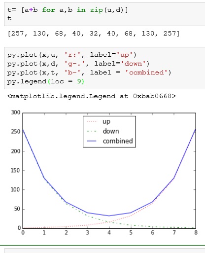
Now, let us do some formatting:
- ‘r:’ – red dotted line
- label = ‘up’ – adds label to the line
- py.legend(loc=9) – adds a legend to the chart

Line 2
For line 2, I want to create a reverse curve:
- d = u – list u is copied to d
- d.reverse() – reverses values in d

Plot the line.
- ‘g-.’ – green dashed line

Combine the two lines

Line 3
Here I use another list comprehension and zip to make our last like. This adds each element of list u and d in order.
- ‘b-‘ – blue solid line
If you enjoyed this lesson, click LIKE below, or even better, leave me a COMMENT.
Follow this link for more Python content: Python
