Note:
If you do not currently have Tableau, you can download a free version at: https://public.tableau.com/s/
Downloads:
Download Practice Excel File Here: School Lunch
Line Chart: 3 or More Measures
This lesson is a continuation of an earlier lesson. If you are already familiar with Tableau, feel free to continue on. Otherwise, check out my first Tableau lesson: Line and Bar Charts
If you want to add 3 or more measures to a line chart, you need to take a different approach than in regular charts.
Import the Data
Select Excel from the Connect menu and select the school lunch excel file you have downloaded.
If you are continuing on from the Line and Bar Charts lesson, you can skip this step, your data is already loaded.

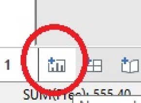
Create a New Worksheet
Click the New Worksheet icon found on the bottom of your screen.

Drag Year to Columns and Measure Values to Rows

- Get rid of Sum(Number of Records) by dragging it back into Measures
- While holding down Ctrl drag Measure Names from the Dimensions slot to Color

And there you have it. 3 Measures in one chart.