Intro to Tableau: Line Chart: 3 or More Measures


 Note:

If you do not currently have Tableau, you can download a free version at: https://public.tableau.com/s/

Downloads:

Download Practice Excel File Here: School Lunch


Line Chart: 3 or More Measures

This lesson is a continuation of an earlier lesson. If you are already familiar with Tableau, feel free to continue on. Otherwise, check out my first Tableau lesson: Line and Bar Charts

If you want to add 3 or more measures to a line chart, you need to take a different approach than in regular charts.

Import the Data

Select Excel from the Connect menu and select the school lunch excel file you have downloaded.

If you are continuing on from the Line and Bar Charts lesson, you can skip this step, your data is already loaded.

tableauIntro1

Create a New Worksheet

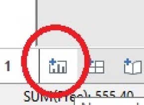
Click the New Worksheet icon found on the bottom of your screen.

tableauIntro3

Drag Year to Columns and Measure Values to Rows

tableau3ormorel1

  1. Get rid of Sum(Number of Records) by dragging it back into Measures
  2. While holding down Ctrl drag Measure Names from the Dimensions slot to Color

tableau3ormorel2

And there you have it. 3 Measures in one chart.

tableau3ormorel3


Intro to Tableau: Dual Axis Charts


 Note:

If you do not currently have Tableau, you can download a free version at: https://public.tableau.com/s/

Downloads:

Download Practice Excel File Here: School Lunch


Dual Axis Charts

This lesson is a continuation of an earlier lesson. If you are already familiar with Tableau, feel free to continue on. Otherwise, check out my first Tableau lesson: Line and Bar Charts

Import the Data

Select Excel from the Connect menu and select the school lunch excel file you have downloaded.

If you are continuing on from the Line and Bar Charts lesson, you can skip this step, your data is already loaded.

tableauIntro1

Create a New Worksheet

Click the New Worksheet icon found on the bottom of your screen.

tableauDual1

Drag Year from Dimensions and Free from Measures into Columns and Rows respectively. You should now have a line chart. (if not, refer to Lesson 1 for troubleshooting tips)

tableauintro4

Now, drag Full Price into Rows. You should now notice you have two graphs. Free up top and Full Price on the bottom.

tableaudual2

Now you could just stop there. You do have both Measures graphed. But this really isn’t the best way analyze this data. It is hard to do a good comparison this way.

Dual Axis

For better analysis, we are going to create a Dual Axis Chart.

Right click on the Y Axis of the bottom chart and select Dual axis

tableaudual3

Now you have both measures on one graph.

tableaudual4

If you look closely at the Left and Right Y-Axis’s, you will notice they are not the same. This could skew how someone would interpret this data.

To fix this, right click on the Right Y-Axis and select Synchronize axis

tableaudual5

Finally, since both of your Y-Axis match up, you don’t need them both. Right click on the Right Axis again and uncheck Show header.

Previous > Lesson 1

Next > 3 or More Measures


Intro to Tableau: Line and Bar Charts


 Note:

If you do not currently have Tableau, you can download a free version at: https://public.tableau.com/s/

Downloads:

Download Practice Excel File Here: School Lunch


Lines and Bar Charts

Start Tableau

When you start up Tableau, the first thing you need to do is select a data source.

tableauIntro1

In this case, select Excel and choose the file the you downloaded above (schoolLunch.xls)

Once loaded, the Data Source Page will open up.

a. Data Source File

b. Shows Sheets in the file (there is only one sheet in this particular file)

c. Shows data.

tableauIntro2

The Data

In this example, we are looking at the number of kids receiving Free, Reduced Priced, and Full Price lunches at American public schools from 1971 to 2015.

Line Chart

Start by making a new sheet

tableauIntro3

A Quick Note About Dimensions and Measures:

Notice on the new sheet that the columns from your imported Excel sheet have been placed into two boxes on the left of the screen: Dimension and Measures. Think of Dimensions as Factors or Labels. While Measures are columns you would perform calculations against (adding, averaging, etc). 

Drag Year from Dimensions and Free from Measures into Columns and Rows respectively.

tableauintro4

The line graph should appear automatically. If not, follow the next steps:

First, make sure your Row variable says SUM(Free)this means we are summing up all numbers in the Free column— If it doesn’t, hover over the measure until a small downward arrow appears. Then go to Measure and select Sum.

tableauIntro5

If you don’t have a line chart, go to Marks and select Line from the drop down menu

tableauIntro6

Bar Chart

Now, go to Marks again and select Bar. Your chart will change over to a bar chart. Try a few of the other options like Area and Shape.

tableauIntro7

Next Lesson: Dual Axis Charts


Tableau: CPI Food Prices 2013-2015

cpifood

This visualization (made using Tableau) shows the CPI (Consumer Price Index) for common food items. While 2014 was bad year for staples such as dairy and meat, 2015 showed a nice recovery. The main exception being eggs. Look at the massive increase in egg prices caused by the bird flu epidemic of 2015.  **note the purple dot represents the 20-Year Historical Average.

Link to Tableau workbook: Workbook

Data found at USDA website: data link

HTM: Visualizing Inspection Schedule Balancing

PM’s can be a real resource drain, especially on the heavy months. That has been one thing that has always confounded me as long as I have worked as an HTM professional (or Biomed  — the name keeps changing). I have never understood why you would have one month with over 1000 scheduled inspections and only 200 scheduled inspections in another month.

The problem is, balancing the workload is a tedious job, sifting through pages of work order lists and moving schedules around. However, if you don’t feel like going cross eyed staring at all of that small text, try giving data visualization a try.

pmSchedule

This graph above(produced using Tableau) shows the scheduled work order load for an imaginary hospital. Note that each color block represents a separate department.

pmSchedule1

Mousing over each colored block provides a fly out showing the Department and record count. You can go here to try the interactive visualization out for yourself: Click here to interact

Looking at this visualization, it is easy to see where departments can be quickly moved around to balance the load. This visualization, if connected to your database, can also become part of a dashboard – allowing you to keep an eye on the work load and prevent it from become unbalanced as departments open and closed and equipment comes and goes.

Now the final data model I created takes more into account than simply the number of records. Using historical data, I add a timing factor to each inspection (this takes into account that the inspection of a diagnostic ultrasound machine will take more time than the inspection of an IV pump). I also add in a personnel factor (if you only have one technician qualified to work on imaging equipment vs 8 technicians for standard patient care equipment, the imaging technician’s time should be weighted to represent that).

Analytics: An Introduction

So exactly what is Analytics? Everyone is talking about it. Colleges and Universities are scrambling to develop programs in it. But what exactly does it mean?

Definition

The the definition I like the best is this:

Analytics: Discovering and communicating meaningful patterns in data.

Analytics are traditionally broken down into the following catagories:

  • Descriptive Analytics: Most people are familiar with this form. So familiar in fact, they probably do not refer to it as analytics. This is looking at past and current data to describe what is going on. Most standard business reporting falls into this category.
  • Predictive Analytics: This is using available data to help predict future events or to provide best guess answers to fill in gaps in data. Using predictive analytics, you can predict how much a house will sell for or what items you should stock near the registers based on current conditions (example: Walmart discovered Pop-Tarts tend to sell well during hurricanes).
  • Prescriptive Analytics: This is the cutting edge of analytics. Prescriptive analytics not only makes predictions about future events, but it utilizes decision making algorithms to determine how to respond to the events. Prescriptive analytics engines could, using the Pop Tarts example above, automatically reroute the shipment of Pop Tarts to stores in hurricane affected areas without any human intervention.

It should be noted that most companies today are still spending most of their time in the descriptive analytics world. That is not necessarily a bad thing. Being able to get the right information in front of a decision maker, in a format that is easily digestible, is a talent all within itself. 

Components

Analytics is not a 1 step process. It is actually a series of steps, often performed in an iterative manner. And just as each business problem is unique, so are the steps to the analytics process used to find the solution.

While the statement above is 100% percent true, I find it very unsatisfying. This is the kind of information I would find when I first developed an interest in analytics. So while I cannot give you a one size fits all answer, I feel that I at least owe you a better explanation than that.

For me, perhaps the best way to understand analytics, is to look at some of the more common tasks performed.

  • Data Management: While designing, building, and maintaining databases and data warehouses may not typically fall under the responsibility of an analytics professional, having a general understanding of how they work is none the less important. Databases and data warehouses are where most businesses keep their data. If you want to be taken seriously as a data professional, you need to have a fundamental understanding of how data is stored and how to query the stored data. (Example Technologies: Hadoop, SQL Server, Oracle)
  • Data Modeling: Data modeling is organizing data into logical structures so that is can be understood and manipulated by a machine. As a simple exercise, make a quick spreadsheet for sales amounts for  5 salespeople across 4 quarters. When you are done, look at the table you created. You have just modeled data. (Example Technologies: Excel, SQL Server, Oracle, Visio)
  • Data Cleaning: While this may not be the sexiest part of the job, it is the part you will spend the most time on. 60-80% of your time will be spent in this phase of the job. And while there are some third party software applications out there that can help ease the pain (Alteryx comes immediately to mind), they are expensive and not every boss will be willing to spring for it. My suggestion is to put sometime aside to become very familiar with Excel. I do 90% of my data cleaning work in Excel and MS SQL Server. (Example Technologies: Excel, SQL Server, Oracle, Alteryx)
  • Data Mining (Machine Learning): Now this is the cool stuff everyone is talking about. Data mining or machine learning, whichever you prefer to call it,  is the Artificial Intelligence (AI) portion of analytics. Data mining is difficult to provide a simple explanation for, but I will try anyway: In traditional programming, the programmer provides explicit instructions to the computer as to how to perform a task. With data mining, data sets are fed through an algorithm. The computer then determines the best way to solve the problem based on the data provided. 

 To help make this a little clearer, how about you try your hand at being the machine.

spam

Look at the pattern above. Without me providing you with any more information,                  you should be able to determine, that two blue squares in a row = SPAM. This is, at                 the most fundamental level, how data mining works. It pours over data and finds                   patterns. Knowing this pattern, if you were now shown only the first three columns               you would be able to predict whether the last column would be red or green.(Example Technologies: R, Python, SAS, XLMiner)

  • Data Visualization: DataViz is fun. It is the real show stopper in the data world. Visualizations make the patterns pop off the page. There are a lot of great programs out there for data visualization. (Again, do not discount Excel — it has some great DataViz features). Now DataViz should rightfully be broken into two separate categories. The first is Exploratory. This is visualizations used by the data professional to help analyze and understand the data. The second is Production. This the finished product that ends up on reports and dashboards for the business users to see. (Example Technologies: Excel, Tableau, R, SAS)
  • Optimization and Simulation: How often is there truly only one solution for a problem? Reality is sometimes the hardest part isn’t coming up with a solution to a problem, but deciding which solution to use. Building optimization models and running simulations helps to provide decision makers with quantitative data as to which solutions will be most effective. (Example Technologies: CPLEX, SAS, Solver)

So I have to learn all of this…

That depends – If your goal to is be a Data Scientist, then yes, you need to learn everything mentioned above and then some (I hope you love Statistics). However, if you are a business user just trying to add analytic skill to your toolbox, my recommendation is to focus your efforts on becoming efficient in data cleaning. In the real world, when trying to put a report together, you often are given data from multiple sources and you have to cobble it together to make sense of it. Learning some data cleaning skills can save you hours on tasks like that.

Once you have workable data, take some time to learn some visualization techniques. An eye popping chart will always garner more attention than pages of numeric columns. Also, take a little time to learn some data mining skills. No one is expecting you to write the complex algorithms the PhD’s at Stanford and MIT are kicking out, but there actually are some pretty user friendly data mining programs out there that help you cull some real insight out of your data.

However you decide to go about it, Analytics is a fascinating, fast growing field. It truly is a 21st century skill. Here at Analytics4All.org, the philosophy is that everyone should develop some analytical talent. Computers were once the sole territory of the science geeks of the world and now they are in everyone’s pockets and purses. Analytics and data driven decision making should also be a accessible to all.