This has to be the most common question on data science I am asked, and honestly it is a hard one to answer. For everyone out there trying to get your foot in the door on your first data job, believe me, I feel for you. Multiple interviews without any offers, or even not getting any interviews at all can be beyond frustrating. Now unfortunately, I do not have any magic trick to get your into the data field, but I can share how I did it.
So, how did I get into the data science field…
Honestly, I “Made” my first job. My first career out of the Army was as a biomedical equipment technician. I fixed medical equipment like patient monitors, ultrasounds, and x-ray machines.
We had a ticketing system called MediMizer where all the repairs and routine maintenance jobs were recorded. My bosses would run monthly reports out the system. I read some of the reports and just felt like we could do better.
I started with just Excel. I downloaded some data, created some pivot charts and made some basic visualizations. I asked new questions from the data. I looked at angles that weren’t covered in the existing reporting.
I showed these to my bosses, my co-workers, other department managers, basically anyone who would listen to me. Then I learned about Tableau, and using its free version I was able to create some more professional looking visualizations.
I learned how to make a dashboard, I started analyzing data sets from other departments, and I began feeding them my reports. I went back to school to get a degree and used what I was learning in school to improve my reporting skills.
While my job title didn’t change, I was now able to put data analysis skills on my resume. I was lucky enough to have very supportive management who saw the value in what I was doing, and allowed me to dedicate some of my time to it.
But most importantly, I was now a data professional (even if not in title). I was using data to solve real world problems. I put together a portfolio of some of the reporting I was doing. This allowed me to show my future employer that not only was I able to create reporting, but more importantly I was able to identify real world business problems and use data to help solve them.
The take away is don’t let your job title hold you back. Look around, what kind of problems do you see? Can you find a data-driven solution to help fix the problem? If you do this, you are a now a data professional (even if not in title). A portfolio made from real world examples can be more impressive than generic tutorial or Kaggle projects.
Remember, when trying to break into a new field, sometimes you need to make your own luck.
You can use the data frame edit() function to manually enter / edit data in R.
Start by creating a data frame.
Note I am initializing each of the columns to datatype(0). This tells R that I while I want the name column to be a character and the age column to be numeric, I am leaving the size dynamic. You can set size limits during the initialization phase if you so choose.
dfe <- data.frame(name=character(0), age = numeric(0), jobTitle = character(0))
Now, let’s use the edit() function to add some data to our data frame
dfe<- edit(dfe)
When the new window pops up, fill in the data and simply click the X when you are done
You may get warning messages when you close out your edit window. These particular messages I got simply informed me that name and jobTitle were set as factors by R. Remember in R, warnings just want you to be aware of something, they are not errors.
Now if you run dfe, you can see your data frame
By running the edit() function again, you can edit the values that currently exist in the data frame. In this example I am going to change Philip’s age from 28 to 29
If you want to add a column to the data frame, just add data to the next empty column
You can just close out now and rename the column in R, or just click on the column header and you will be able to rename it there.
Now we have a new column listing pets
name age jobTitle pet
1 Ben 42 Data Sc cat
2 Philip 29 Data Ana dog
3 Julia 36 Manager frog
You can use the edit() function to manually edit existing data sets or data imported from other sources.
In statistics, data transformations are used, for lack of better words, to even out the numbers. While there are lots of reasons to perform transformations in the world of Statistics, in Data Science and Analytics, our main concern is to bring distributions to the normal form (the classic bell curve).
As with many concepts, sometimes it is easy to see by doing. So let’s jump into Excel, you can download the file to play along here: transform1
First things first – Install Analysis Toolkit
In order to created histograms in Excel (which we will need for this exercise), you need to install the Analysis Toolkit.
Click on the green “File” in the upper left corner of Excel, then click options.
Click Add-Ins > select Analysis TookPak
Hit OK and now lets look at our data.
The Data
We have two columns –
UNITSF =10,000 records of house square footage
Bins = list of Bin sizes we will use for the histogram
First we will create a histogram to look at the data.
To do so, go to the Data tab in the Ribbon bar. Then on the far right select Data Analysis
Select Histogram
For Input Range – select number values from the UNITSF column.
Bin Range – select number values from Bin column
Now you get a Frequency Distribution. Let’s visualize it to see better.
In the Ribbon Bar, select Insert>Recommended Charts
Select the Frequency bar chart
Look at this Frequency distribution. Notice how it bunched to the left. In Stats – they call this Right-Skewed since the long tail trails out to the right.
The problem is, many popular data mining (machine-learning) algorithms can be easily thrown off by data like this. The algorithms (like regressions, decision trees, boosted forests, naive bayes, etc.) are designed to work better with normal distributions.
So to normalize this distribution, we have to transform the data. What that means in practice is to apply a mathematical operation to all the data in the column. Operations like: logs, square roots, cube roots, squaring, cubing, etc.
In our example, the natural log does a very good job of transforming our data.
To do so, lets start by applying the natural log to the first element in our data.
=ln(A2)
Now hover over the little green box in the bottom corner until your cursor turns into a black plus sign. Double click and the natural log will be applied to all elements.
Build a new bin column ranging from 3 – 11 by .5
Now lets build our frequency table. Data> Data Analysis > Histogram
Make sure you select the B column for Input and E column for Bin Range
Now go to your new distribution and graph it like we did before.
Notice how the new distribution looks a lot more like the class bell curve.
Data cleaning is one of the least enjoyable tasks for data professionals. Unfortunately, most data scientists I have spoken to state that data cleaning makes of 60% to 70% of their work load.
While there is no magic data cleaning machine I am aware of, there are some tips and tricks that you can learn to save you a lot of time and head aches. I have put together a 2 part video series using Excel that shows some of the most common data cleaning tasks:
Handling Duplicates
Spelling Errors
Missing Data
Converting Data
Merging Data Sets
I even have the Excel worksheet available for download so you can work along with the videos.
For this tutorial, you will need to have Power Query installed. If you are running Office 2016, Power Query should already be available. For Excel 2010 and 2013, here is a link to the download: Power Query
If you open the Excel file, you will see 3 sheets with 3 tables (Work Order, Vehicles, Prices). We want to populate a single sheet combining the three tables into one data set.
Open up a New Excel Workbook (A new file. Do not try working from the practice file). From the Ribbon bar select Power Query > From File > From Excel
Select the practice file: dataCleaningPQuery.xlsx and when the Navigator pops up, select Work Orders
Select Load. Once the work order loads, repeat the process, this time loading Prices.
**Note if the Query Editor window pops up, just click Close and Load. We will be working in the Query Editor window later.
Now go to the sheet with the Work Order table on it. Power Query > Merge
A) The top drop down box should already be populated. If not, select Work Orders for top and then select Prices for the bottom.
B) Now highlight the Service Columns in both tables.
C) Leave the Join Kind at Left Outer.
A Left Outer Join works as seen below. The left table is displayed in full and the the right table adds data based on columns that match up against data in the left table.
Note the text below “The selection has matched 29 out of the first 29 rows.” This is because if you look at the two columns we selected, they both have matching text. It is through this matching that we are able to line up the two tables into one.
Click OK and the Query Editorwindow will pop up.
Select the dual arrow icon in the NewColumnheader and deselect Servicefrom the list.
Right click the NewColumn and Rename it Price. Click on it and hold down the mouse button. Now drag it so that price sits in between Service and Mech.
Hit Close & Load and your new merged table should look like this:
Ok, now to load the Vehicle sheet.
Power Query > From File > From Excel. Select excel practice file and select Vehicles. DO NOT HIT LOAD this time. Instead, select Edit.
If you look at the original data set, the Lic Plate column in the Work Order sheet and Licence Plate in Vehicles are the two column we need to match up. Unfortunately, they currently do not match. In the second table, the licence plates are preceded by the letters Lic. We need to remove this.
Right click on the Licence Plate> Replace Values
Type Lic into Value to Find and leave Replace with blank. **Note — the Value to Find is “Lic ” with a space after it. Make sure you add the space.
Click OK, the Licence Plate column will remove the Lic. Click Close & Load
Now it is time to merge. Go back to the Work Order sheet and click Merge
Set the top table to Work Orders. Set the bottom to Vehicles. Highlight Lic Plates and Licence Plate columns. Set Join to Left Outer Join and click okay.
Click the double arrows on the new column and un-check column 1.
Rename the new columns Make and Model. Highlight both column and move them in between Lic Plate and Service. Click Close&Load
Congratulations. You have now successfully merged 3 tables into 1 using Power Query. Now you can go forth and analyze the data.
I get a weekly data file of patient alarm data. This data is collected continuously throughout the day. However, the data must be exported manually and is usually done in the middle of the day. So the first and last data samples in my set could be taken at 14:41 one week apart. Since I only want to have full days worth of day, I like to truncate the data at midnight – deleting any partial days from the data set.
Instead of having to manually look at the data and determining when to cut off my data, I wrote the following simple script.
This script takes advantage of SQL’s variable functionality. Notice you need to declare your variables ahead of time. One thing to keep in mind is that variables only exist within their scripting block. Meaning once you are done executing this block of code, the variables are dropped from memory and no longer available to further code blocks.
I set the variables value using an inline Select statement. The nested function in the Select statement reads like this:
convert(date, (dateadd(dd,1,min(dateField))))
It is actually a combination of the following functions – by order of operation:
Dateadd()
dateadd(dd,1,min(dateField)) = add 1 day(dd) to the minimum date (min(dateField)) in the table ** the dateadd function always starts at 12:00 AM when adding or subtracting a day
Convert()
Convert the value from Dateadd() above to the Date format.
Finally:
Delete from Table1 where dateField not between @start and @end go
This final block of coat deletes every record in NOT in between the dates represented by the @Start and @End variables
SQL Code
declare @start date
declare @end date
set @start = (select convert(date,(dateadd(dd,1,min(dateField)))) from Table1)
set @end = (select convert(date,(dateadd(dd,0,max(dateField)))) from Table1)
delete from Table1
where date not between @start and @end
go
Download the SQL file here:Data Cleaning with SQL
**Zip Folder contains the SQL file as both an SQL file and Txt for easy
viewing by people who don't have SQL Server installed
Data preparation and cleaning is not a lot of fun. Data preparation is especially irritating when you have to repeat the task over and over again. While no one has come up with a data cleaning magic wand that I am aware of, there are some ways to automate the dreaded process.
While there are many software offerings out there that can help you with data cleaning, some are very expensive and have a high learning curve. So in this article I am going to focus on SQL Server. I chose SQL Server for the following reasons:
SQL programming is vital skill to have if you want to work in data
SQL Server readily available. Many companies have it. If you don’t have access to a current SQL Server, you can download the Express version for free.
The Problem
You work for a university and scheduling software is sorely out of date. The reporting capabilities are limited to 4 pre-canned reports. There is no money for an upgrade, but your boss is asking you for some reports that are not available from the system.
So you go to extract some data from the outdated software, but the program only lets you extract the following 4 columns (Start Date, Class, Professor, Classroom).
Let’s look at the data
Here is the data sample you pulled.
To effectively create the reports your boss is asking for, you need to add a few more data points.
Now, while these columns can be added manually, keep in mind a class schedule at a even a small university is at least 100 classes. And when you consider that you will have to repeat this process for every new semester, finding a way to automate this process will save you a lot of time in the end.
Step One – Get the data into SQL Server
First, let’s create a new database to work with.
Open up SQL Server Management Studio > Object Explorer > right click > Databases > New Database
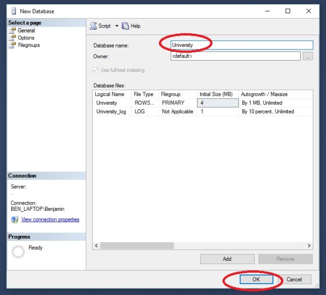
In the New Database window, give your new database the name University and click OK
Right click on your new database > Tasks > Import Data
On the Welcome to SQL Server Data Import and Export Wizard click Next
On Choose a Data Source, select Microsoft Excel from the drop down. Then browse to your downloaded Excel file: dataCleanWSQL.xlsx
Select SQL Server Native Client from the drop down. If your are working on the same machine as your SQL Server instance, you can just put a period “.” in Server Name. Otherwise you would need the server name. Database should be pre-filled with University.
Select Copy data from one or more tables or views and click Next
Take note of Destination name ([dbo].[Sheet1$]) and click Next
Click Next and Finish. You will watch the process. Note how many rows transferred. This should match up to your source data.
Back in the Object Browser go to University> Tables > dbo.Sheet1$. Right click and Select Top 1000 Rows.
Here is the output, showing the contents of your imported data
Step 2- Write the SQL Script
Load the SQL script by going to File>Open>File and choose DataCleanwSQL.SQL
While this is not an SQL tutorial, I will give a brief overview of the script file
**note GO in SQL indicates a complete block of code. This code will be completed before the script continues one to the next block of code. While it is not always needed, it is good coding practice
The first block of code: use University, simply tells SQL Server which database we are working with.
The next block: alter table, lets you make changes to an existing time. In this case, we are adding 3 column for out new data fields to go in (day, department, building).
The next block is an update block. In this block we set the value of our new column day by datename(dw, [start date]). This converts the datetime stamp from [start date] to a weekday name.
The next block is a Case Statement. This works like a nested If – Then -Else statement in many languages. In this block we are stating When the value of Class column is like ‘Calc%’ ( % is a wildcard in SQL) Then set the value of the department column to ‘Math’
The next code block is another Case statement. This one is using a between statement though, stating that When the Classroom column value is between 100 and 199 then set the value of Building to A
Finally Select * from dbo.sheet1$
displays the contents of the table.
Now we have our data the way we want it. You connect you BI tool to SQL Server to work with the data, you can export it as a CSV file, or you can just copy an paste it into Excel for further analysis.
4
Step 3: Repeat as needed
The great advantage the method above is that now we have a script we can run again over and over. So the next semester, when you download the new class listing, you don’t have to spend a lot of time on data prep. You simply have to import it into SQL Server and run your script.
Transposing a table or matrix is a method of rotating or pivoting a table so the rows become the columns and the columns become the rows. Excel offers a couple of methods of performing this action without having to manually recreate the table.
Click here to download the Exercise File: Transpose
Method 1: Paste Special
This method is very simple.
Highlight the table,Right Click> Copy
Select a cell where you want the Transposed Table
Right Click > Paste Special > Select the Transpose Clipboard
Closer look at the Transpose Clipboard Icon
Method 2: Transpose()
While the Paste Special method works well, it does require user interaction. If you want to automate the process, you can use the Transpose() function.
Highlight some blank cells. Make sure you highlight enough to fit you data. In this case, we need to highlight 4 down and 5 across.
Now click inside function bar (ƒx) Type the following: =transpose(
Highlight the table you wish to transpose: =transpose(A1:D5
Close the function: transpose(A1:D5)
Now hold down Shift+Ctrl and press Enter
Argument for Method 2
While the Paste Special method is easy to use, here is a major draw back to it. Notice the red circled cells. After creating Transposed tables using the Transpose()method and the Paste Special method, I changed the Sensor 1 Qrt 3 value from 23 to 24. Notice the Transpose() table updates with the new information, while the Paste Special table does not.
So exactly what is Analytics? Everyone is talking about it. Colleges and Universities are scrambling to develop programs in it. But what exactly does it mean?
Definition
The the definition I like the best is this:
Analytics:Discovering and communicating meaningful patterns in data.
Analytics are traditionally broken down into the following catagories:
Descriptive Analytics: Most people are familiar with this form. So familiar in fact, they probably do not refer to it as analytics. This is looking at past and current data to describe what is going on. Most standard business reporting falls into this category.
Predictive Analytics:This is using available data to help predict future events or to provide best guess answers to fill in gaps in data. Using predictive analytics, you can predict how much a house will sell for or what items you should stock near the registers based on current conditions (example: Walmart discovered Pop-Tarts tend to sell well during hurricanes).
Prescriptive Analytics: This is the cutting edge of analytics. Prescriptive analytics not only makes predictions about future events, but it utilizes decision making algorithms to determine how to respond to the events. Prescriptive analytics engines could, using the Pop Tarts example above, automatically reroute the shipment of Pop Tarts to stores in hurricane affected areas without any human intervention.
It should be noted that most companies today are still spending most of their time in the descriptive analytics world. That is not necessarily a bad thing. Being able to get the right information in front of a decision maker, in a format that is easily digestible, is a talent all within itself.
Components
Analytics is not a 1 step process. It is actually a series of steps, often performed in an iterative manner. And just as each business problem is unique, so are the steps to the analytics process used to find the solution.
While the statement above is 100% percent true, I find it very unsatisfying. This is the kind of information I would find when I first developed an interest in analytics. So while I cannot give you a one size fits all answer, I feel that I at least owe you a better explanation than that.
For me, perhaps the best way to understand analytics, is to look at some of the more common tasks performed.
Data Management: While designing, building, and maintaining databases and data warehouses may not typically fall under the responsibility of an analytics professional, having a general understanding of how they work is none the less important. Databases and data warehouses are where most businesses keep their data. If you want to be taken seriously as a data professional, you need to have a fundamental understanding of how data is stored and how to query the stored data. (Example Technologies: Hadoop, SQL Server, Oracle)
Data Modeling:Data modeling is organizing data into logical structures so that is can be understood and manipulated by a machine. As a simple exercise, make a quick spreadsheet for sales amounts for 5 salespeople across 4 quarters. When you are done, look at the table you created. You have just modeled data. (Example Technologies: Excel, SQL Server, Oracle, Visio)
Data Cleaning: While this may not be the sexiest part of the job, it is the part you will spend the most time on. 60-80% of your time will be spent in this phase of the job. And while there are some third party software applications out there that can help ease the pain (Alteryx comes immediately to mind), they are expensive and not every boss will be willing to spring for it. My suggestion is to put sometime aside to become very familiar with Excel. I do 90% of my data cleaning work in Excel and MS SQL Server. (Example Technologies: Excel, SQL Server, Oracle, Alteryx)
Data Mining (Machine Learning):Now this is the cool stuff everyone is talking about. Data mining or machine learning, whichever you prefer to call it, is the Artificial Intelligence (AI) portion of analytics. Data mining is difficult to provide a simple explanation for, but I will try anyway: In traditional programming, the programmer provides explicit instructions to the computer as to how to perform a task. With data mining, data sets are fed through an algorithm. The computer then determines the best way to solve the problem based on the data provided.
To help make this a little clearer, how about you try your hand at being the machine.
Look at the pattern above. Without me providing you with any more information, you should be able to determine, that two blue squares in a row = SPAM. This is, at the most fundamental level, how data mining works. It pours over data and finds patterns. Knowing this pattern, if you were now shown only the first three columns you would be able to predict whether the last column would be red or green.(Example Technologies: R, Python, SAS, XLMiner)
Data Visualization: DataViz is fun. It is the real show stopper in the data world. Visualizations make the patterns pop off the page. There are a lot of great programs out there for data visualization. (Again, do not discount Excel — it has some great DataViz features). Now DataViz should rightfully be broken into two separate categories. The first is Exploratory. This is visualizations used by the data professional to help analyze and understand the data. The second is Production. This the finished product that ends up on reports and dashboards for the business users to see. (Example Technologies: Excel, Tableau, R, SAS)
Optimization and Simulation:How often is there truly only one solution for a problem? Reality is sometimes the hardest part isn’t coming up with a solution to a problem, but deciding which solution to use. Building optimization models and running simulations helps to provide decision makers with quantitative data as to which solutions will be most effective. (Example Technologies: CPLEX, SAS, Solver)
So I have to learn all of this…
That depends – If your goal to is be a Data Scientist, then yes, you need to learn everything mentioned above and then some (I hope you love Statistics). However, if you are a business user just trying to add analytic skill to your toolbox, my recommendation is to focus your efforts on becoming efficient in data cleaning. In the real world, when trying to put a report together, you often are given data from multiple sources and you have to cobble it together to make sense of it. Learning some data cleaning skills can save you hours on tasks like that.
Once you have workable data, take some time to learn some visualization techniques. An eye popping chart will always garner more attention than pages of numeric columns. Also, take a little time to learn some data mining skills. No one is expecting you to write the complex algorithms the PhD’s at Stanford and MIT are kicking out, but there actually are some pretty user friendly data mining programs out there that help you cull some real insight out of your data.
However you decide to go about it, Analytics is a fascinating, fast growing field. It truly is a 21st century skill. Here at Analytics4All.org, the philosophy is that everyone should develop some analytical talent. Computers were once the sole territory of the science geeks of the world and now they are in everyone’s pockets and purses. Analytics and data driven decision making should also be a accessible to all.