R: K-Means Clustering

Note: This is an introductory lesson with a made up data set. After you are finished with this tutorial, if you want to see a nice real world example, head on over to Michael Grogan’s website:

http://www.michaeljgrogan.com/k-means-clustering-example-stock-returns-dividends/

K Means Cluster will be our introduction to Unsupervised Machine Learning. What is Unsupervised Machine Learning exactly? Well, the simplest explanation I can offer is that unlike supervised where our data set contains a result, unsupervised does not.

Think of a simple regression where I have the square footage and selling prices (result) of 100 houses. Taking that data, I can easily create a prediction model that will predict the selling price of a house based off of square footage. – This is supervised machine learning

Now, take a data set containing 100 houses with the following data: square footage, house style, garage/no garage, but no selling price. We can’t create a prediction model since we have no knowledge of prices, but we can group the houses together based on commonalities. These groupings (clusters) can be used to gain knowledge of your data set.

I think seeing it in action will help.

Here is the data set: cluster

The data we will be looking at test results for 149 students.

2016-12-06_22-09-28.jpg

The task at hand is to group the students into 3 groups based on the test results. Now one thing any teacher will let you know is that some kids perform well in one subject and perhaps not so well in another. So we can’t simply group them on the score performance on one test. And when you are dealing with real world data, you might be looking at 20 -100 test/quiz scores per student.

So what we are going to do is let the computer decide how to group (or cluster) them.

To do so, we are going to be using K-means clustering. K-means clustering works by choosing random points (centroids). It then groups the data points around the centroids based which centroid the points are closest to.

Let’s get started

Let’s start by loading the data

st <- read.csv(file.choose())
head(st)

our data

2016-12-06_22-23-40.jpg

Now let’s run the data through a Kmeans() algorithm

First, we are only going to want to focus on columns 2 and 3 in the data set since column 1 (studentID) is basically a label and provides no value in prediction.

To do this, we subset the data: st[,2:3] – which means I want all row ([,) and columns 2-3 (2:3])

2016-12-06_22-27-11.jpg

Now the code to make our clusters

stCl <- kmeans(st[, 2:3], 3, nstart = 20)
stCl

The syntax is kmeans(DATA, Number of clusters, Numbers of random starts)

Number of clusters I picked as 3 because I know this works well with the data, picking the right number usually takes a little trial and error in real life

Number of random starts is how many times you want the algorithm to be rerun (choosing new centroids each time) and choosing the result where the clusters are tightest.

Below is the output of our Kmeans – note the cluster means, this tells us the mean score for TestA and TestB set in each cluster.

2016-12-06_22-36-33.jpg

Hey, if you are a math junkie, this may be all you want. But if you are looking for some more practical value here, lets move on.

First, we need to add a column to our data set that shows our columns.

Now since we read our data from a csv, it is a data frame. If you can’t remember that, you can always run the command is.data.frame(st) to test it out.

Do you remember how to add a column to a data frame?

Well, there are multiple ways, but this is, in my opinion, the easiest way.

st$cluster <- stCl$cluster

is.data.frame(st)
st$cluster <- stCl$cluster
head(st)

Here is the result

2016-12-06_22-43-22.jpg

Now with the clusters, you can group your students based their assigned cluster.

Technically we are done here. We have successfully grouped the students. But what if you want to make sure you did a good job. One quick check is to graph your work.

Before we can graph, we have to make sure our st$cluster column is set as a factor, then using ggplot, we can graph it. (if you don’t have ggplot2 installed, you will need to run this line: install.packages(“ggplot2”)

library(ggplot2)
st$cluster <- as.factor(st$cluster)
ggplot(st, aes(TestA, TestB, color = cluster)) + geom_point()

And here is our output. The groups look pretty good.

graph.jpeg

R: Working with lists

Lists in R allow you to store data of different types into a single data structure. While they are extremely useful, they can be a bit confusing to work with at first.

Let’s start by creating a list. The syntax is simple enough, just add list() around the elements you want to put in your list.

l1 <- list(24, c(12,15,19), "Dogs")
l1

Here is the output. Note we have 3 different groupings. 1 number, 1 vector (with 3 elements) and 1 character

2016-12-05_14-20-32.jpg

You can call on each element using the element names (found in the double brackets [[]])

l1[[2]]
l1[[1]]

Here are the results

2016-12-05_14-26-55

Now, what if you want to call 1 element from the vector in [[2]]

You do this by adding [] to the end of the line

l1[[2]][3]

This will give you the 3rd number in the vector found in [[2]]

2016-12-05_14-27-10

To make it easier to work with lists, you can rename the elements.

names(l1)  # shows NULL since the elements have no names
names(l1) = c("Number", "Vector", "Char")
names(l1) # now shows assigned names


Now you can call on the list using the names.

l1$Char # will return "Dogs"

l1$Vector[2] #will return the second number in the vector in the list

You can also simply name your elements when creating your list

rm(l1) #deletes list
l1 <- list(Number=24,Vector = c(12,15,19), Char="Dogs")

You can add a new element to you list via number

l1[[4]] = "New Element"

Even better, you can add via new name

l1$Char2 <- "Cat"

Now let’s look at our list

2016-12-05_14-42-47.jpg

Now we can use the names() function to give element 4 a name, or we can just get rid of it.

To delete an elements, use NULL

l1[[4]] <- NULL

Now the last thing we will cover is how to subset a list

l1[1:3] # gives us elements 1 -3

2016-12-05_14-50-32.jpg

We want to pick some elements out of order

l1[c(2,4)]
l1[c("Number","Char")]

2016-12-05_14-51-56


R: Converting Factors to Numbers

R, like all programming languages, has its quirks. One of the more frustrating ones is the way it acts when trying to convert a factor into a numeric variable.

Let’s start with a vector of numbers that have been mistakenly loaded as characters.

chars <- c("12","13","14","12","11","13","12")
chars
typeof(chars)

Here is the output

2016-12-03_15-49-23.jpg

Now, let’s convert this vector to a numeric vector using the function as.numeric()

nums <- as.numeric(chars)
nums
typeof(nums)

And here is the output

2016-12-03_15-55-40.jpg

As you can see it works fine.

But now let’s try it with a factor

fac <- factor(c("12","13","14","12","11","13","12"))
fac
typeof(fac)

Here is the output.

2016-12-03_15-58-06.jpg

Now look what happens when I try the as.numeric() function

nums <- as.numeric(fac)
nums
typeof(nums)

Check out the results

2016-12-03_16-00-11

While is says the type is a double, clearly the numbers are not correct.

How to fix it?

Well, the secret is that first you need to convert the factor into a character, then into a numeric.

nums <- as.numeric(as.character(fac))
nums
typeof(nums)

Now check out the results

2016-12-03_16-02-30.jpg

Now we have the correct numbers. Just keep this little trick in mind. It has caused me some undue frustration in past.


R: Twitter Sentiment Analysis

Having a solid understanding of current public sentiment can be a great tool. When deciding if a new marketing campaign is being met warmly, or if a news release about the CEO is causing customers get angry, people in charge of handling a company’s public image need these answers fast. And in the world of social media, we can get those answers fast. One simple, yet effective, tool for testing the public waters is to run a sentiment analysis.

A sentiment analysis works like this. We take a bunch of tweets about whatever we are looking for (in this example we will be looking at President Obama). We then parse those tweets out into individual words and we count the number of positive words and compare it to the number of negative words.

Now the simplicity of this model misses out on some things. Sarcasm can easily missed. Ex. “Oh GREAT job Obama. Thanks for tanking the country once again”. Our model will count 2 positive words (Great and Thanks) and 1 negative word (tanking) giving us an overall score of positive 1.

There are more complex methods for dealing with the issue above, but you’ll be surprised at how good the system works all by itself. While, yes we are going to misread a few tweets, we have the ability to read thousands of tweets, so the larger volume of data negates the overall effect of the sarcastic ones.

First thing we need to do is go get a list of good and bad words. You could make your own up, but there are plenty of pre-populated lists on the Internet for free. The one I will be using is from the University of Illinois at Chicago. You can find the list here:

http://www.cs.uic.edu/~liub/FBS/sentiment-analysis.html

Once you go to the page, click on Opinion Lexicon and then download the rar file.

You can dowload from the link below, but I want you to know the source in case this link breaks.

Now open the rar file and move the two text files to a folder you can work from.

Next let’s make sure we have the right packages installed. For this we will need, TwitteR, plyr, stringr, and xlsx. If you do not  have these packages installed, you can do so using the following code. (just change out TwitteR for whatever package you need to install)

install.packages("TwitteR")

Now load the libraries

library(stringr)
library(twitteR)
library(xlsx)
library(plyr)

and connect to the Twitter API. If you do not already have a connection set up, check out my lesson on connecting to Twitter: R: Connect to Twitter with R

api_key<- "insert consumer key here"
api_secret <- "insert consumer secret here"
access_token <- "insert access token here"
access_token_secret <- "insert access token secret here
setup_twitter_oauth(api_key,api_secret,access_token,access_token_secret)

Okay, so now remember where you stored the text files we just downloaded and set that location as your working directory (wd). Note that we use forward slashes here, even if you are on a Windows box.

setwd("C:/Users/Benjamin/Documents")
neg = scan("negative-words.txt", what="character", comment.char=";")
pos = scan("positive-words.txt", what="character", comment.char=";")

scan looks through the text files and pulls words that start with characters and ignores comment lines that start with ;

You should now have 2 lists of positive and negative words.

You can add words to either list using a  vector operation. Below I added wtf – a popular Internet abbreviation for What the F@#$@ to the negative words

neg = c(neg, 'wtf')

Okay, now here is the engine that runs our analysis. I have tried to comment on what certain commands you may not recognize do.  I have lessons on most features listed here, and will make more lessons on anything missing. If I were to try to explain this step by step, this page would be 10000 lines long and no one would read it.

score.sentiment = function(tweets, pos.words, neg.words)
 
{
 
require(plyr)
require(stringr)

scores = laply(tweets, function(tweet, pos.words, neg.words) {


tweet = gsub('https://','',tweet) # removes https://
tweet = gsub('http://','',tweet) # removes http://
tweet=gsub('[^[:graph:]]', ' ',tweet) ## removes graphic characters 
       #like emoticons 
tweet = gsub('[[:punct:]]', '', tweet) # removes punctuation 
tweet = gsub('[[:cntrl:]]', '', tweet) # removes control characters
tweet = gsub('\\d+', '', tweet) # removes numbers
tweet=str_replace_all(tweet,"[^[:graph:]]", " ") 

tweet = tolower(tweet) # makes all letters lowercase

word.list = str_split(tweet, '\\s+') # splits the tweets by word in a list
 
words = unlist(word.list) # turns the list into vector
 
pos.matches = match(words, pos.words) ## returns matching 
          #values for words from list 
neg.matches = match(words, neg.words)
 
pos.matches = !is.na(pos.matches) ## converts matching values to true of false
neg.matches = !is.na(neg.matches)
 
score = sum(pos.matches) - sum(neg.matches) # true and false are 
                #treated as 1 and 0 so they can be added
 
return(score)
 
}, pos.words, neg.words )
 
scores.df = data.frame(score=scores, text=tweets)
 
return(scores.df)
 
}

Now let’s get some tweets and analyze them. Note, if your computer is slow or old, you can lower the number of tweets to process. Just change n= to a lower number like 100 or 50

tweets = searchTwitter('Obama',n=2500)
Tweets.text = laply(tweets,function(t)t$getText()) # gets text from Tweets

analysis = score.sentiment(Tweets.text, pos, neg) # calls sentiment function

Now lets look at the results. The quickest method available to us is to simply run a histogram

hist(analysis$score)

My results looks like this

2016-11-25_14-39-39

If 0 is completely neutral most people are generally neutral about the president and more people have positives tweets then negatives ones. This is not uncommon for an outgoing president. They generally seem to get a popularity boost after the election is over.

Finally, if you want to save your results, you can export them to excel.

write.xlsx(analysis, "myResults.xlsx")

And you will end up with a file like this

2016-11-25_14-44-06.jpg

R: Decision Trees (Regression)

Decision Trees are popular supervised machine learning algorithms. You will often find the abbreviation CART when reading up on decision trees. CART stands for Classification and Regression Trees.

In this example we are going to create a Regression Tree. Meaning we are going to attempt to build a model that can predict a numeric value.

We are going to start by taking a look at the data. In this example we are going to be using the Iris data set native to R. This data set

iris

2016-11-21_21-33-52.jpg

As you can see, our data has 5 variables – Sepal.Length, Sepal.Width, Petal.Length, Petal.Width, and Species. The first 4 variables refer to measurements of flower parts and the species identifies which species of iris this flower represents.

In the Classification example, we tried to predict the Species of flower. In this example we are going to try to predict the Sepal.Length

In order to build our decision tree, first we need to install the correct package.

install.packages("rpart")

library(rpart)

Next we are going to create our tree. Since we want to predict Sepal.Length – that will be the first element in our fit equation.

fit <- rpart(Sepal.Length ~ Sepal.Width + Petal.Length + Petal.Width+ Species, 
 method="anova", data=iris )

Note the method in this model is anova. This means we are going to try to predict a number value. If we were doing a classifier model, the method would be class.

Now let’s plot out our model

plot(fit, uniform=TRUE, 
 main="Regression Tree for Sepal Length")
 text(fit, use.n=TRUE, cex = .6)

Note the splits are marked – like the top split is Petal.Length < 4.25

Also, at the terminating point of each branch, you see and n= . The number following this is the number of elements from the data file that fit at the end of that branch.

2016-11-22_22-05-26

While this model actually works out pretty good, one thing to look for is over fitting. A good sign of that would be having a bunch of branches terminating with n values of 1 or 2. This means the model is tuned too much to the test data and when run up against a new set of data it will most likely result in poor predictions.

Of course we can look at some of the numbers if you are so inclined.

2016-11-22_22-11-14

Notice the xerror (cross validation error) gets better with each split. That is something you want to look out for. If that number starts to creep up as the splits increase, that is a sign you may want to prune some of the branches. I will show how to do that in another lesson.

To get a better picture of the change in xerror as the splits increase, let’s look at a new visualization

par(mfrow=c(1,2)) 
rsq.rpart(fit)

This produces 2 charts, 1rst on shows how R-Squared improves as splits increase (remember R-squared gets better as it approaches 1 so this model is improving with each spit)

The second chart shows how xerror decreases with each split. For models that need pruning, you would see the curve starting to go back up as the splits increase. Imagine is split 6 was higher than split 5.

2016-11-22_22-26-51

Okay, so finally now that we know the model is good, let’s make a prediction.

testData  <-data.frame (Species = 'setosa', Sepal.Width = 4, Petal.Length =1.2,
 Petal.Width=0.3)
predict(fit, testData, method = "anova")

2016-11-22_22-32-30

So as you can see, based on our test data, the model predicts our Sepal.Length will be approx 5.17.


R: Decision Trees (Classification)

Decision Trees are popular supervised machine learning algorithms. You will often find the abbreviation CART when reading up on decision trees. CART stands for Classification and Regression Trees.

In this example we are going to create a Classification Tree. Meaning we are going to attempt to classify our data into one of the (three in this case) classes.

We are going to start by taking a look at the data. In this example we are going to be using the Iris data set native to R. This data set

iris

2016-11-21_21-33-52.jpg

As you can see, our data has 5 variables – Sepal.Length, Sepal.Width, Petal.Length, Petal.Width, and Species. The first 4 variables refer to measurements of flower parts and the species identifies which species of iris this flower represents. What we are going to attempt to do here is develop a predictive model that will allow us to identify the species of iris based on measurements.

The species we are trying to predict are setosa, virginica, and versicolor. These are our three classes we are trying to classify our data as.

In order to build our decision tree, first we need to install the correct package.

install.packages("rpart")

library(rpart)

Next we are going to create our tree. Since we want to predict Species – that will be the first element in our fit equation.

fit <- rpart(Species ~ Sepal.Length + Sepal.Width + Petal.Length + Petal.Width,
 method="class", iris)

Now, let’s take a look at the tree.

plot(fit)
text(fit)

To understand what the output says, according to our model, if the Pedal.Length is < 2.45 then the flower is classified as setosa. If not, it goes to the next split – Petal Width. If < 1.75 then versicolor, else virginica.

2016-11-21_21-55-29

Now, we want to take a look at how good the model is.

printcp(fit)

I am not going to harp too much on the stats here, but lets look down at the table on the bottom. The first row has a CP = 0.50.  This means (approx) that the first split reduced the relative error by 0.5. You can see this in the rel error in the second row.

Now the 2nd row CP = 0.44, so the second split improved the rel error in the third row to 0.06.

Now personally, when just trying to get a quick overview of the goodness of the model, I look at the xerror (cross validation error) of the final row. 0.10 is a nice low number.

2016-11-21_21-58-52

Okay, now lets make a prediction. Start by creating some test data

testData <-data.frame (Sepal.Length = 1, Sepal.Width = 4, Petal.Length =1.2, 
+ Petal.Width=0.3)

Now let’s predict

predict(fit, testData, type="class")

Here is the output:

2016-11-21_22-21-35.jpg

As you can see, the model predicted setosa. If you look back at the tree, you will see why.

Let’s do one more prediction

newdata<-data.frame(Sepal.Length=c(3,8,7,5),
 Sepal.Width=c(2,3,2,6),
 Petal.Length=c(5.4,3.2,4.6,5.3),
 Petal.Width=c(4,3,6,1.3))
 
predict (fit, newdata, type="class")

Here is the output

2016-11-21_22-23-31.jpg

The model predicts 1,2,3 are virginica and 4 is versicolor.

Now go find some more data and try this out.

R: laply and ldply from plyr package

R is great programming language when it comes to manipulating data. That is one of the reasons it is so loved by data scientists and statisticians. Being an open source project, R also has the advantage of lots of additional packages that add even more functionality to the language.

The package I am focusing on today is the plyr package. I am just going to barely dip into this package, as I am only go to cover two functions from the package (laply and ldply).  I am covering these as I will be using them in a later lesson how to perform sentiment analysis on Twitter data.

First things first though, you need to download the package.

install.packages("plyr")
library(plyr)

The functions

laply takes in a list, applies a function, and exports the results into an array.

ldply takes in a list, applies a function, and exports the results into a dataframe.

The syntax for both is simple enough:

laply(list, function(x){ func.. })

We are going to do a simple example, creating a list of words and passing this list to a function that will count the characters in each string and then we will multiply the result times 2.

#create data
l = list('dog','cat','horse','donkey')

l1 = laply(l, function(x){x1=nchar(x) 
                          x1 = x1*2})

If you now check l1, it will return an array of 6,6,10,12 (disclaimer – since this is a single column array  R actually places it into a simple vector)

Now let’s try ldply which return a dataframe ( more useful in my opinion)

l2 = ldply(1, function(x) {x1 =nchar(x)*2})
  
#add words to l2 dataframe
l2$word <- l

Checking the output of l2 now returns a two column dataframe.

2016-11-18_22-13-36

R: Connect to Twitter with R

You can do a lot in the way of text analytics with Twitter. But in order to do so, first you need to connect with Twitter.

In order to do so, first you need to set up an account on Twitter and get an API key. Once you have created your account, go to the following website: https://dev.twitter.com/

Once there, click My apps

twiiter

Click Create New App

twitter1

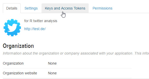
Give name, description (it doesn’t matter – matter anything up), for website I just used http://test.de

twiiter2

Go to Keys and Access Tokens

twitter3

Get your Consumer Key (API Key), Consumer Secret (API Secret), Access Token, and Access Token Secret

Now open R and install the TwitteR package.

install.packages("twitteR")

Now load the library

library(twitteR)

Next we are going to use the API keys you collected to authorize our connection to the Twitter API (Twitter uses OAuth by the way)

api_key<- "insert consumer key here"
api_secret <- "insert consumer secret here"
access_token <- "insert access token here"
access_token_secret <- "insert access token secret here
setup_twitter_oauth(api_key,api_secret,access_token,access_token_secret)

Now to test to see if your connection is good

searchTwitter('analytics')

R: gsub

Gsub

R is an interpreted language – meaning the code is run as it is read – kind of like a musician who plays music while reading it off the sheet(note by note). To that end, R does not perform loops as efficiently as compiled languages like C or Java. So to address this issue, R has some interesting work-arounds. One of my favorite is gsub.

Here is how gsub works. Take the sentence “Bob likes dogs”. Using gsub I can replace any element of that sentence. So I can say replace “dogs” with “cats” and the sentence would read “Bob like cats”. Kind of cool all by itself, but it is even cooler when dealing with a larger data set.

Let’s set x to a vector of 3 elements

 x <- c("the green ball", "Bob likes the dog", "Sally is the best runner
 in the group")

Now let’s run a gsub command (syntax: gsub(to be replace, what to replace with, date source)

x <- gsub("the", "a", x)

This short line of code replaces all the “the” in the vector with “a”. It does it for a vector of 1000 elements just as well as it does it for this small vector of 3 elements.

gsub1

Okay, now my personal pet peeve when it comes to learning this stuff. Show me a practical approach to this. So here we go, a practical data science based use for this.

Check out this selection of tweets I pulled from Twitter. Notice the annoying RT “retweet” at the beginning of most of tweets. I want to get rid of it. When doing a sentiment analysis, knowing something is a RT does little for me.

gsub2

gsub to get rid of RT

gsub3.jpg

Now I have an empty space I want to get rid.

gsub4.jpg

And if you are wondering how I got that Twitter data? Don’t worry, you don’t need any expensive software. I did it all with R for free and I will show you how to do it too. Stay tuned.

R: Simple Linear Regression

Linear Regression is a very popular prediction method and most likely the first predictive algorithm most be people learn. To put it simply, in linear regression you try to place a line of best fit through a data set and then use that line to predict new data points.

linear1

If you are new to linear regression or are in need of a refresher, check out my lesson on Linear Regression in Excel where I go much deeper into the mechanics: Linear Regression using Excel

Get the Data

You can download our data set for this lesson here: linear1

Let’s upload our file into R

df <- read.csv(file.choose())
head(df)

linReg1

Now our data file contains a listing of Years a person has worked for company A and their Salary.

Check for linear relationship

With a 2 variable data set, often it is quickest just to graph the data to check for a possible linear relationship.

#plot data
attach(df)
plot(Years, Salary)

Looking at the plot, there definitely appears to be a linear relationship. I can easily see where I could draw a line through the data.

linReg2.jpg

An even better way to do it is to check for correlation. Remember the closer to 1, the better the correlation found in the data.

#check for correlation
cor(Years, Salary)

linReg3.jpg

Since our correlation is so high, I think it is a good idea to perform an linear regression.

Linear Regression in R

A linear regression in R is pretty simple. The syntax is lm(y, x, data)

#perform linear regression
fit <- lm(Salary~Years, data= df)
summary(fit)

linReg4.jpg

Now let’s take a second to break down the output.

The red box shows my P values. I want to make sure they are under my threshold (usually 0.05). This becomes more important in multiple regression.

The orange box shows my R-squared values. Since this is a simple regression, both of these numbers are pretty much the same, and it really doesn’t matter which one you look at. What these numbers tell me is how accurate my prediction line is. A good way to look at them for a beginner is to consider them to be like percentages. So in our example, our prediction model is 75-76% percent accurate.

Finally, the blue box are your coefficients. You can use these numbers to create your predictive model. Remember the linear equation: Y = mX + b? Well using your coefficients here our equation now reads Y = 1720.7X + 43309.7

Predictions

You can use fitted() to show you how your model would predict your existing data

fitted(fit)

linReg5.jpg

You can also use the predict command to try a new value

predict(fit, newdata =data.frame(Years= 40))

linReg7

Let’s graph our regression now.

plot(Years, Salary)

abline(fit, col = 'red')

linReg8

The Residuals Plot

I am not going to go too deep into the weeds here, but I want to show you something cool.

layout(matrix(c(1,2,3,4),2,2))  # c(1,2,3,4) gives us 4 graphs on the page, 

                                #2,2 - graphs are 2x2
plot(fit)

I promise to go more into this in a later lesson, but for now, I just want you to note the numbers you see popping up inside the graphs. (38,18,9) – These represent outliers. One of the biggest problems with any linear system is they are easily thrown off by outliers. So you need to know where you outliers are.

linReg9.jpg

If you look at the points listed in your graphs in your data, you will see why these are outliers. Now while this doesn’t tell you what to do about your outliers, that decision has to come from you, it is a great way of finding them quickly.

linReg10.jpg

The Code

# upload file
df <- read.csv(file.choose())
head(df)

#plot data
attach(df)
plot(Years, Salary)

#check for correlation
cor(Years, Salary)

#perform linear regression
fit <- lm(Salary~Years, data= df)
summary(fit)

#see predictions
fitted(fit)

predict(fit, newdata =data.frame(Years= 40))

#plot regression line 
plot(Years, Salary)

abline(fit, col = 'red')

layout(matrix(c(1,2,3,4),2,2)) 
plot(fit)

df