
Box whisker plots are used in stats to graphically view the spread of a data set, as well as to compare data sets.
If you would like to follow along with this example, he is the data set: sensors
Using pandas, let’s load the data set
%matplotlib inline
import pandas as pd
import matplotlib as mp
import matplotlib.pyplot as plt

sensorDF = pd.read_excel("C:\Users\Benjamin\Documents\sensors.xlsx")
sensorDF.head()
Our data set represents monthly readings taken from 4 sensors over the span of a year

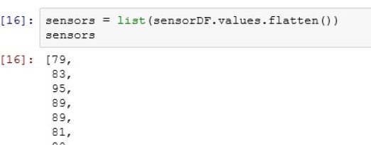
We need to convert the dataframe to a list values for our box plot function.
To do this, first we need to flatten() our dataframe. The flatten() method places all the values from the dataframe into 1 list
Now let us chop the list into the for sensors represented by the rows in our dataframe

Finally, we need to make a list of these lists

I know that seemed like a lot, but you will spend more time cleaning and prepping data than any other task. It is just the nature of the job.
Let’s Plot
The code for creating a boxplot is now easy.

Let’s label our chart a little better now.


Simply wish to say your article is as astounding. The clarity in your post is simply spectacular and i could assume you’re an expert on this subject. Fine with your permission allow me to grab your RSS feed to keep up to date with forthcoming post. Thanks a million and please keep up the gratifying work.
Topairtools http://www.topairtools.com/