

In this two part lesson, we are going to build the above dashboard using QLIK Sense. If you don’t already have QLIK Sense, you can download a free trial here: Download
You can download the data set I am working with here: WO
Create new app
Once you have QLIK Sense up and running, click Create new app

Name you new app. I am calling mine DASH

Click Open App
Next click Add data

Now select Excel files – I created my real dashboard using the SQL connector, however it is easier to load the Excel files. So I am using Excel in this lesson. I will show how to load SQL into QLIK in another lesson.

Navigate to the folder you saved the downloaded files to and select WO.xlsx

Note – you can uncheck columns you do not want to use from your data, but I have already removed all unwanted columns for this exercise.

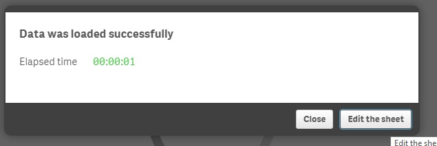
click Load data and finish on the bottom

Once data loads, click Edit the sheet
Now we have a blank sheet to work with

Build the Dashboard
Click on Bar chart and drag it into the upper right corner
You will now be asked for a Dimension and a Measure. If you are not familiar with these terms in data, a dimension is like a category while a measure is something you can add, count, etc.

For Dimension, we will select RequestedOn > Month

For Measure, select WorkOrderKey
 Now select Count

Now resize your bar chart by dragging it by the corner.

Next, drag a KPI over from the options in the left column. Place it to the right of your Bar Chart
As a measure, select Scheduled > SUM

Now select Filter pane from the left column and place it next to your KPI. For dimension, select FacilityCode
 Now, let’s drag over a Line Chart. Place it below your bar chart. Set Dimension to RequestedON> Date. Set your measure to WorkOrderKey> Count

Now, let’s add a Pie Chart to the right of our line chart. Set Dimension to DepartmentCode and Measure to WorkOrderKey > Count

Now lets clean it up. Click in the upper right corners of your charts that say Click to add title. Give your charts some titles.
Once you have done that, click the Done button in the upper right corner.

Now play with your new dashboard.

In the next lesson, I will show how to add more versatility to your dashboard through used of formulas and Set Analysis.