SQL: Create a View

I am working with MS SQL Server and the AdventureWorks2012 database in this lesson. If you want to play along, but do not have either installed on your computer, check out the following lessons to get you up and running:

Views

A view is a virtual table created in SQL that pulls information from existing tables in the database. To understand the need for a view, imagine you are the DBA for AdventureWorks constantly being asked to produce email addresses for employees. You are being asked this because whoever designed the front end of the database that your users interact with, left this vital piece of information out.

Finding an employee’s email address is simple enough. The SQL query below is all you need.

SELECT p.[FirstName]
 ,p.[MiddleName]
 ,p.[LastName]
 ,e.EmailAddress
 
 FROM [Person].[Person] as p join [Person].[EmailAddress] as e
 on p.BusinessEntityID = e.BusinessEntityID

Just add a where statement depending on if you are searching by first or last name.

But what if you are getting tired of having to create this query over and over every day. Well, you could make this query a permanent part of your database by turning it into a view.

The syntax for creating a view is simple. Just add Create View [NAME] and AS

create view HumanResources.vEmail
as 
SELECT p.[FirstName]
 ,p.[MiddleName]
 ,p.[LastName]
 ,e.EmailAddress
 
 FROM [Person].[Person] as p join [Person].[EmailAddress] as e
 on p.BusinessEntityID = e.BusinessEntityID

go

After you run this query, you can now find your view in the Object Explorer

view.jpg

You can now query the view just like you would any other table.

 select *
 from HumanResources.vEmail
 where LastName like 'Ken%'

Views are great especially when dealing with very complex joins. Once you have figured out the proper query, you can just save it as a join and you won’t have to reinvent the wheel next time you need it.


Python: Hypothesis Testing(T Test)

Hypothesis testing is a first step into really understanding how to use statistics.

The purpose of the test is to tell if there is any significant difference between two data sets.

Consider the follow example:

Let’s say I am trying to decide between two computers. I want to use the computer to run advanced analytics, so the only thing I am concerned with is speed.

I pick a sorting algorithm and a large data set and run it on both computers 10 times, timing each run in seconds.

Now I put the results into two lists. A and B

a = [10,12,9,11,11,12,9,11,9,9]
b = [13,11,9,12,12,11,12,12,10,11]

A quick look at the data makes me think b is slower than a. But is it slower enough to mean something or are these results just a matter of chance (meaning if I ran the test 200 more times would the end result be closer to equal or further apart).

Hypothesis test

To find out, let’s do a hypothesis test.

Set our Hypothesis:

  • H0 = H1 – there is no significant difference between data sets
  • H0 <> H1 – there is a significant difference

To test our hypothesis, let’s run a t-test

import stats from scipy and run stats.ttest_ind().

Our output is the z-statistic and the p-value.

Our p-value is 0.08 – greater than the common significance value of 0.05. Since it is greater, we cannot reject H0=H1. This means both computers are effectively the same speed.

hypoTest

Let’s try a third computer – d

d = [13,12,9,12,12,13,12,13,10,11]

Now, let’s run a second T-test.  This one comes back with a p-value of 0.026 – under 0.05. This means we can reject our hypothesis that a=d. The speed differences between a and d are significant.

hypoTest1

R: ANOVA (Analysis of Variance)

Performing an ANOVA is a standard statistical test to determine if there is a significant difference between multiple sets of data. In this lesson, we will be testing the readings of 4 sensors over the span of a year.

To play along, you can download the CSV file here: sensors

Load our library

library(HH)

Anova1

Let’s get the data into R

 mydata <- read.csv(file.choose())
 head(mydata)

Anova.jpg

Let’s make our data set a bit more user friendly by giving our sensors names (S1,S2,S3,S4)

row.names(mydata) <- c("S1","S2","S3","S4")
head(mydata)

Anova1.jpg

Now, our data is in cross tab format. Great for human reading, but not for machine. We need to adjust our data a little.

#transpose the data
mydataT <- t(mydata)
mydataT

Anova2

Now we need to stack the data. Before we can do that though, we need to convert it from a matrix to a dataframe

mydataDF <- as.data.frame(mydataT)

Now let’s stack() our data

myData1 <- stack(mydataDF)
head(myData1)

Anova3

stack() makes your data more computer readable. Your column names are turned into elements in a column called “ind”

Now let’s test our data

I know there were a lot of steps getting here, but I want to assure you that your data will never come in the format you need it in. You will always have to do some sort of manipulation to get it in the format you need.

Box plot (box-whisker plot)

Box plots are a great way to visualize multiple data sets to see how they compare.

bwplot(values ~ ind, data = myData1, pch="|")

Anova4.jpg

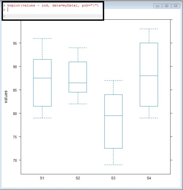
Take a look at S3, look at how offset it looks – The median doesn’t even cross the 1-3 quartiles of S1,S2, or S4

Anova5.jpg

But is this difference significant?

What do I mean by significant? Well, the easiest way for me to explain significance in this case is – can the difference shown above be repeated by random chance? If I took another sampling of the readings would this difference be present or would maybe a difference sensor be out of range?

We use a test called ANOVA (Analysis of Variance) to find out:

ANOVA (one way)

The code in this case is simple enough

myData1.fix.aov <- aov(values ~ ind, data=myData1)
anova(myData1.fix.aov)

It is the results I want to spend a moment on

Anova6

Df of ind= 3 – degrees of freedom – calculated by (4 Sensors – 1)

Df Residuals =44 – this is calculated by total row 48 – 4(the 4 sensors used above)

Sum Sq and Mean Sq = Sum of Squares and Mean Sum of Squares. I am not going to go into the math here, but these two values are calculated comparing the means between our 4 sensors.

You use the Sum Sq and Mean Sq to calculate the F value. You then go find an F chart like the one here: link

You will look up the F ratio (3,44) 3 across, 44 down. These numbers come from the Df( degrees of freedom column). If you look on the table, you will see an F value of 2.82. Our value is 7.4195 WAYYY more than 2.82. This means our ANOVA test proves significance.

It should be noted that the ANOVA test does not tell which sensor is the one out of range. In fact, you could have one or two sensors out of range. We do not know yet. All we know is that something is significantly different.

p-value

Now I know there are some Stat savvy people reading this who are just dying for me to point out the obvious.

Anova7.jpg

The value circled above is your p value. Most standard significance tests use 0.1 or 0.05 as a value to shoot for. If your p-value comes under these values, you have something. Our p-value is 0.0003984 – way under. We definitely found proof of variance.

mean-mean comparison

Now let’s see what values are different. To do this, we can use a mean-mean comparison chart.

model.tables(myData1.fix.aov, "means")
myData1.fix.mmc <- mmc(myData1.fix.aov, linfct = mcp(ind = "Tukey"))
myData1.fix.mmc
mmcplot(myData1.fix.mmc, style = "both")

You can review the Tukey values below

Anova8.jpg

But I prefer just looking at the chart. To get a quick understanding of how to read this chart, look at the vertical dotted line down the center of the chart. This is the zero line. Now look at the horizontal lines. All the black ones cross the zero line – they are within range of each other.

Look at the red lines now. These are our lines that include S3. It is the means comparisons with S3 that don’t cross the zero line.

This tells you that S3 is the sensor out of range

Anova9

Looking back at our box-whisker plot, this really isn’t a surprise

Anova5

HOV – Brown Forsyth

Finally to confirm our one-way Anova, we have one more test to pass. That is the the homogeneity of variance (Brown Forsyth) test.

In order for a F-test to be valid, the group variances within data must be equal.

hovBF(values ~ ind, data=myData1)
hovplotBF(values ~ ind, data=myData1)

Again, I am not going to go into the math, just show you how to read it.

the HOV plot runs difference measures of the spreads of the variances from each sensor from the group median. As you can see in the middle and right plots, the boxes all overlap each other. In a failed HOV, one of the medians in the right plot would not over lap the other 3 boxes.

Anova11.jpg

In an HOV, looking at our p-value is once again the quickest approach. The p-value here is 0.14 – well above normal significance levels of 0.10 and 0.05.

So, this means there is no reason to disclaim our F-test.

Anova10.jpg

So to wrap up everything above, you want a low P value for your F-test and a high P-value for your HOV.

Sorry if you head is spinning a little here. The goal of my site is to go light on the math and show you how to let the computer do the work.

The Code

library(HH)

#get data
mydata <- read.csv(file.choose())
head(mydata)

#name rows
row.names(mydata) <- c("S1","S2","S3","S4")
head(mydata)

#transpose data
mydataT <- t(mydata)

#change to dataframe
mydataDF <- as.data.frame(mydataT)

#stack your data
myData1 <- stack(mydataDF)
head(myData1)

#box whisker plot
bwplot(values ~ ind, data=myData1)

#anova
myData1.fix.aov <- aov(values ~ ind, data=myData1)
anova(myData1.fix.aov)

#mmc
model.tables(myData1.fix.aov, "means")
myData1.fix.mmc <- mmc(myData1.fix.aov, linfct = mcp(ind = "Tukey"))
myData1.fix.mmc
mmcplot(myData1.fix.mmc, style = "both")

# homogeneity of variance – Brown Forsyth
hovBF(values ~ ind, data=myData1)
hovplotBF(values ~ ind, data=myData1)


Python: Printing with .format()

Another way to print variable values in Python is the .format(). This method replaces %d,%s, and %r, but I still showed them to you in an earlier lesson as you will still see them in use, I wanted you to know about them.

When using .format() – {} represents your place holder in the string.

Screenshot 2022-07-04 204102

You can also use numbers to tell format which order to use values in.

Screenshot 2022-07-04 204336

You can name your place holders:

Screenshot 2022-07-04 204624

You can use user input:

Screenshot 2022-07-04 205204

Try your code in our online Python console:  

Last Page: Print variables and user input

Next Page: Lists and Dictionaries

Back to Python Course: Course

SQL: Stored Procedures

Stored procedures are basically executable scripts you store in your database. You can then execute them as needed. Instead of discussing what they are, let’s just make one and see how it works.

Example

We are going to create a stored procedure that returns an employee’s email address based on their first name.

I am using AdventureWorks2012 in MS SQL Server for this lesson. If you do not have either installed and would like to follow along, check out my first two SQL lessons to get up and running:

  1. MS SQL Server: Installation
  2. SQL: SELECT Statement

If you are already up and running, let’s consider the SQL Query below

SELECT p.[FirstName]
 ,p.[MiddleName]
 ,p.[LastName]
 ,e.EmailAddress
 
 FROM [Person].[Person] as p join [Person].[EmailAddress] as e
 on p.BusinessEntityID = e.BusinessEntityID
 where p.FirstName like 'Ken'

I am using two tables, Person and EmailAddress from the schema Person

From my query, I am asking for the FirstName, MiddleName, LastName, and EmailAddress for any employee with the first name Ken.

While this works, the problem is if someone asks you to look for people named Kevin tomorrow, you would have to create this query all over again. Or, we can build a Stored Procedure

Stored Procedure

Let’s create a stored procedure. In this example, we are going to use a variable. In SQL you must declare you variables.

Variables are designated in SQL with the @ symbol in front. So our first line of code below translates to: create procedure dbo.getemail (create a stored procedure name dbo.getemail)  – @name nvarchar(20) – (use a variable named @name which is a character variable limited to 20 characters)

as – (states the code following “as” will be the code executed by the stored procedure)

finally – note the where statement was altered to include the @name variable

create procedure dbo.getemail @name nvarchar(20)
as
SELECT p.[FirstName]
 ,p.[MiddleName]
 ,p.[LastName]
 ,e.EmailAddress
 
 FROM [Person].[Person] as p join [Person].[EmailAddress] as e
 on p.BusinessEntityID = e.BusinessEntityID
 where p.FirstName = @name
go

Once you execute the code above, your stored procedure can be found in your database

storedProcedure

Execute the Stored Procedure

To execute – exec “procedure name” “variable” = “value”

exec dbo.getmail @name=’Kevin’

storedProcedure1.jpg

Now change the value of @name to ‘Mary’

storedProcedure2

R: Boxplot – comparing data

We are going to make some box plots in R to compare readings of 4 sensors over 1 calendar year.

To play along, download the CSV file here: sensors

HH

First, call library(HH) – if HH won’t load, you may need to install the package: R: Installing Packages

Data

First, let us import the CSV file. Using the following command, R will open a window allow you to search for your file.

SenData  <- read.csv(file.choose())

boxplot.jpg

Using the head() command, let’s look at our data.

What we have is monthly readings for 4 sensors (1-4)

boxplot1.jpg.

Our data is in tabular (often called cross-tab) format This is great for human readability, but computers don’t really like it.

Let’s use stack() to change our data into a computer friendly format.

boxplot2.jpg

Boxplot

using bwplot – we are going to plot values against “ind” – months. Note we set out data to the SenD matrix

boxplot3

What we get is the box plot below

boxplot4.jpg

a box plot – or box and whisker plot – provides a graphical representation of the median as well as 1rst,2nd,3rd and 4th quartiles. Lining them up lets you see how data in each unit compare to each other.

boxplot6.jpg

Let’s add some color to the chart.

boxplot7.jpg

boxplot8.jpg

Notice the month are in alphabetical order. Let’s fix that.

boxplot9

boxplot10

Let’s break our time frame into quarters now.

To better understand the code

  • SenD$quarter <- creates a new variable named quarter
  • factor() — creates a factor
  • c() – creates a vector
  • rep(1,12) … – repeats 1 twelve times then 2 twelve times, etc.
  • We use 12 because we have 3 months in a quarter, and 4 sensors per month 3*4 = 12

boxplot12.jpg

boxplot11

Here is some code to plot our quarters. I think if you look at the code and plot, you should be able to make out most of the additions.

**hint pch=8 turns the median line into “*”

boxplot13

boxplot14.jpg


R: Building Matrices

Working with matrices is very useful when working with data. A matrix gives you a two dimensional table similar to what you are used to in programs like Excel. In R, there are couple of different ways in which you can build a matrix.

Matrix()

The syntax for this command is matrix(data, number of rows, number of columns, fill by row, dimension names)

Lets start slow:

Lets build our data:

x <- 1:20

Now, lets build a 4×5 matrix

matrix.jpg

Notice how the numbers fill in by column, with column 1 being 1-4, column 2 then picks up with 5-8.

If you want to have your numbers fill in by Rows instead, we need to add a fourth argument. We are going to set Fill By Row to True.

matrix1.jpg

Now the final argument will be the dimension names. If you want something other than the numbers assigned by default, you need to provide dimension names in the form of a List

matrix2.jpg

Get Data From Matrix

First let us assign the matrix to  a variable. I am using capital “A”. Capital letters are commonly used to represent matrices. You will see this in most Linear Algebra books.

We call information out of the matrix by using the place in the table.

A[row, column]

  • A[1,3] – I call the number 3- which is located in the 1rst Row 3rd Column
  • A[1,] – returns the entire 1rst row
  • A[,1] -returns the entire 1rst column
  • A[“Row3″,”C”] – shows you can use the dimension names if you wish

matrix3.jpg

rbind()

rbind() stands for row bind. This is a method for binding multiple vectors into a matrix by row.

First we create 3 vectors (x,y,z) then we turn them in a matrix using rbind()

matrix4.jpg

cbind()

cbind() is just like rbind() but it lines yours vectors up by columns

matrix5

Change Dimension Names

If you want to change the dimension names after the matrix has already been created.

matrix6

Code

x <- 1:20

# build a 4 by 5 matrix
matrix<-(x,4,5)

#fill columns rows first
matrix<-(x,4,5,T)

#add dimension names
matrix(x,4,5,T,list(c("Row1","Row2","Row3","Row4"),c("A","B","C","D","E")))

#assign the matrix to a variable
A <- matrix(x,4,5,T,list(c("Row1","Row2","Row3","Row4"),c("A","B","C","D","E")))

#call matrix
A[1,3]

#call row
A[1,]

#call column
A[,1]
#call data point by row and column name
A[“Row3”,”C”]

#rbind()
x <- c(1,2,3,4)
y <- c("Hi","How","are","you")
z <- c(6,7,8,9)

rbind(x,y,z)

#cbind()
x <- c(1,2,3,4)
y <- c("Hi","How","are","you")
z <- c(6,7,8,9)

#change dimension names
A <- cbind(x,y,z)
colnames(A) = c("C1","C2","C3")
row.names(A) = c("R1","R2","R3","R4")
A

R: Installing Packages

Packages extend the capabilities of R. Packages contain libraries of code, functions, and data sets. While it is possible to create all your code from scratch, but why would you when someone has already done all the work for you.

Installing Packages in R is easy. For this lesson, we will install the HH package

-> install.packages(“HH”)

Or, you can use the GUI (graphical user interface)

From the top menu, Packages>Install package(s)…

rPackages

Select a CRAN mirror. I like to pick one close to me.

rPackages1

This lists all packages available on that mirror. I prefer this method as you can see a list of package and their proper spelling.

I chose HH.

rPackages2

Now just sit back and watch it install.

rPackages3

Python: Logistic Regression

This lesson will focus more on performing a Logistic Regression in Python. If you are unfamiliar with Logistic Regression, check out my earlier lesson: Logistic Regression with Gretl

If you would like to follow along, please download the exercise file here: logi2

Import the Data

You should be good at this by now, use Pandas .read_excel().

df.head() gives us a the first 5 rows.

What we have here is a list of students applying to a school. They have a Score that runs from 0 -1600,  ExtraCir (extracurricular activity) 0 = no 1 = yes, and finally Accepted 0 = no 1 = yes

logi1

Create Boolean Result

We are going to create a True/False column for our dataframe.

What I did was:

  • df[‘Accept’]   — create a new column named Accept
  • df[‘Accepted’]==1  — if my Accepted column is 1 then True, else False

logi1

What are we modeling?

The goal of our model is going to be to predict and output – whether or not someone gets Accepted based on some input – Score, ExtraCir.

So we feed our model 2 input (independent)  variables and 1 result (dependent) variable. The model then gives us coefficients. We place these coefficients(c,c1,c2) in the following formula.

y = c + c1*Score + c2*ExtraCir

Note the first c in our equation is by itself. If you think back to the basic linear equation (y= mx +b), the first c is b or the y intercept. The Python package we are going to be using to find our coefficients requires us to have a place holder for our y intercept. So, let’s do that real quick.

logi2


Let’s build our model

Let’s import statsmodels.api

From statsmodels we will use the Logit function. First giving it the dependent variable (result) and then our independent variables.

After we perform the Logit, we will perform a fit()

logi3.jpg

The summary() function gives us a nice chart of our results

logi4.jpg

If you are a stats person, you can appreciate this. But for what we need, let us focus on our coef.

logi45.jpg

remember our formula from above: y = c + c1*Score + c2*ExtraCir

Let’s build a function that solves for it.

Now let us see how a student with a Score of 1125 and a ExCir of 1 would fair.

logi9

okayyyyyy. So does 3.7089 mean they got in?????

Let’s take a quick second to think about the term logistic. What does it bring to mind?

Logarithms!!!

Okay, but our results equation was linear — y = c+ c1*Score + c2*ExCir

So what do we do.

So we need to remember y is a function of probability.

logis1

So to convert y our into a probability, we use the following equation

logis2

So let’s import numpy so we can make use of e (exp() in Python)

logi8.jpg

Run our results through the equation. We get .97. So we are predicting a 97% chance of acceptance.

logi10.jpg

Now notice what happens if I drop the test score down to 75. We end up with only a 45% chance of acceptance.

logi11.jpg


If you enjoyed this lesson, click LIKE below, or even better, leave me a COMMENT. 

Follow this link for more Python content: Python


What is Big Data?

Big Data is Like Teenage Sex: Everyone talks about it, nobody really knows how to do it, everyone things everyone else is doing it, so everyone claims they are doing it.

– Dan Ariely

I remember when I first started developing an interest in Big Data and Analytics. One of the biggest frustrations I faced was that it seemed like everyone in the know was talking in code. They would toss words around like supervised machine learning, map reduce, hadoop, SAP HANA, in-memory, and the biggest buzz word of them all, Big Data.


So what is Big Data?

In all honesty, it is a buzzword. Big Data isn’t a single thing as much as it is a collection of technologies and concepts that surround the management and analysis of massive data sets.

What kind of data qualifies as Big Data?

The common consensus you will find in textbooks is that Big Data is concerned with the 3 V’s: Velocity, Volume, Variety.

Velocity: Velocity is not so much concerned with how fast the data gets to you. This is not something you can clock using network metrics. Instead, this is how fast data can become actionable. In the days of yore, managers would rely on monthly or quarterly reports to determine business strategy. Now these decisions are being made more dynamically. Data only 2 hours old can be viewed outdated in this new high velocity world.

Volume: Volume is the name of the game in Big Data. Think of sheer volume of data produced by a wireless telecom company: every call, every tower connection, length of calls, etc. These guys are racking up terabytes upon terabytes.

Variety:  Big Data is all about variety. As a complete 180 from the rigid structure that makes relational databases work, Big Data lives in the world of unstructured data. Big Data repositories are full of videos, pictures, free text, audio clips, and all other forms of unstructured data.

How do you store all this data?

Storing and managing all this data is one of big challenges. This is where specialized data management systems like Hadoop come into play. What makes Hadoop so great? First it is Hadoop’s ability to scale. By scale I mean, Hadoop can grow and shrink on demand.

For those unfamiliar with the back end storage methodology of standard relational databases (Oracle, DB2, SQL Server), they don’t play well across multiple computers. Instead you will find you need to invest in high end servers and plan out ahead any clusters you are going to use with a general idea of your storage needs in mind. If you build out a database solution designed to handle 10 terabytes and suddenly find yourself needing to manage 50, you are going to have some serious (and expensive) reconfiguration work ahead of you.

Hadoop on the other hand is designed to run easily across commodity hardware. Which means you can have a rack full of mid priced servers and Hadoop can provision and utilize them at will. So if you typically run at 10 terabyte database and there is a sudden need to run another 50 terabytes – (your company is on-boarding a new company) Hadoop will just grow as needed (assuming you have 50 tb worth of commodity servers available). It will also free up the space when it is done. So if the 50 terabytes were only needed for a particular job, once that job is over, Hadoop can release the storage space for other systems to use.

What about MapReduce?

MapReduce is algorithm designed to make querying or processing massive data sets possible. In a very simplified explanation MapReduce works like so:

Map – The data is broken into chunks and handed off to mappers. These mappers perform the data processing job at on their individual chunk of the data set. There are hundreds (or many many hundreds) of these mappers working in parallel, taking advantage of different processors on the racks of commodity hardware we were talking about earlier.

Reduce – The output of all of these map jobs are then passed into the reduce. This part of the algorithm puts all the pieces back together, providing the user with one result set. The entire purpose behind MapReduce is speed.

Data Analytics

Now that you have the data, you are going to want to make some sense of it. To pull information out of this mass of data requires specially designed algorithms running on high end hardware. Platforms like SAP HANA tout in memory analytics to drive up speed, while a lot of the buzz around deep learning seems to mention accessing the incredibly fast memory found in GPUs (graphical processor units).

At the root of all of this, you will still find some old familiar stand-bys. Regression is still at the top of pack in prediction methods used by most companies. Other popular machine learning algorithms like Affinity Analysis (market basket) and Clustering are also commonly used with Big Data.

What really separates Big Data analytics from regular analysis methods is that with it’s sheer volume of data, it is not as reliant on inferential statistical methods to draw conclusions.

If you think about an election in a city with 50,000 registered voters. The classic method of polling was to ask a representative sample (say 2000 voters) how they were going to vote. Using that information, you  could infer how the election was to play out (with a margin of error of course). With Big Data, we are asking all 50,000 voters. We do not need to infer anymore. We know the answer

Imagine this more “real world” application example. Think of a large manufacturing plant. A pretty common maintenance strategy in a plant like this is to have people perform periodic checks on motors, belts, fans, etc. They will take reading from gauges, write them on a clipboard and maybe the information is enter into a computer that can analyze trends to check for out of range parameters.

In the IoT(Internet of Things) world, we now have cheap, network connected sensors on all of this equipment sending out readings every second. This data is fed through algorithms designed to analyze trends. The trends can tell you a fan is starting to go bad and needs to be replaced 2 or 3 days before most humans could.

Correlation

Big Data is all about correlation. And this can be a sticking point for some people. As humans, we love to look for a root cause. If we can’t find one, we often create one to satisfy our desire for one – hence the Roman volcano gods.

With Big Data, cause is not name of the game. Analyzing massive streams of data, we can find correlations that can help up make better decisions. Using the fan example above, the algorithms may pick up that if the fan begins drawing more current while maintaining the same speed that the soon the fan motor will fail. And using probabilistic algorithms, we can show you the increasing odds of it failing each minute, hour, or day you ignore it.

This we can do, with great certainty in many instances. But what we can’t do is tell you why it is happening. That is for someone else. We leave whys to the engineers and the academics. We are happy enough knowing If A Then B.


Correlation can also show us relationship we never knew existed. Like did you know Pop Tarts are hot sellers in the days leading up to a hurricane? Walmart does. They even know what flavor ( I want to say strawberry, but don’t quote me on this).

This pattern finding power can be found everywhere from Walmart check outs, to credit card fraud detection, dating sites, and even medicine.