

matplot() is a R function that you can use to make easy graphs in R.
Let’s start by creating a data set.
We are going to create a 5 x 10 matrix representing 10 quiz and test grades for 5 students
x <- sample(50:100,50, T)
x
# convert to a 5x10 matrix
A <- matrix(x,5,10)
A


Let’s make name our rows and columns
#name and assignments vectors
names <- c("Sara", "Jill", "Jared", "Kim", "Don")
assignments <- c("Quiz 1", "Quiz 2", "Test 1", "Quiz 3", "Quiz 4", "Midterm", "Quiz 5", "Quiz 6", "Test 2","Final")
#assign labels to columns and rows
row.names(A) <- names
colnames(A) <- assignments
A


Let’s graph it
Start simple
matplot(A)


Note our X axis goes to 5 – we are graphing students against grades.
What if I want to graph assignments against grades? Simple, transpose the matrix
matplot(t(A))


Okay, but the numbers are distracting. Let’s do something about that.
matplot(t(A), type="b")


I don’t like the numbers
# replace numbers with shapes
matplot(t(A), type="b", pch=15:19)
pch 15:19 lets us rotate through 4 shapes (15 – 19) – try different numbers on your own
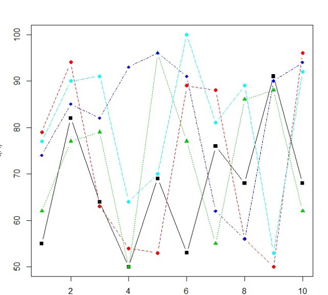

I am adding a color element next. You will see the need for this in our next section.
matplot(t(A), type="b", pch=15:18, col=c(1:5))
This has no current effect on our graph
Legend
Let’s add a legend
legend("bottomleft", inset=0.01, legend=names, col=c(1:5),pch=15:19,
bg= ("white"), horiz=F)
okay, here is the syntax: legend(location, padding, legend data, colors, symbols, background, horizontal vs vertical layout)
This is why I added the color element to our matplot, so the colors in the legend would match up to the colors in my graph.

