

Download worksheet here: ExcelCharts2
Our data set contains 3 sets of readings for 4 sensors (A,B,C,D)


Scatter Plot
Reading 1
Highlight Columns A and B – From Ribbon > Insert>Scatter
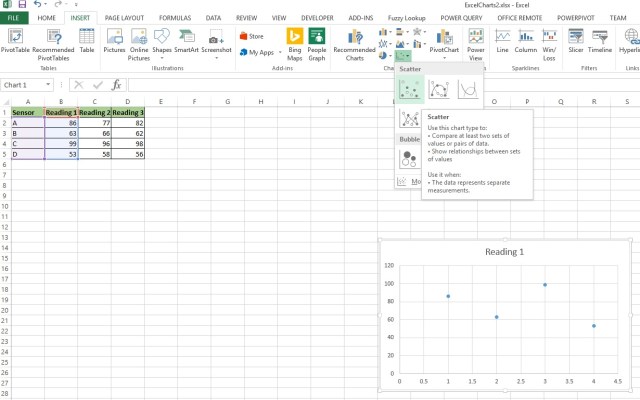

Here is a close up of the Scatter Plot icon


Here is our plotting of Reading 1


Reading 2
To add the Reading 2 column to the plot, right click on the chart area and Select Data


Select Add
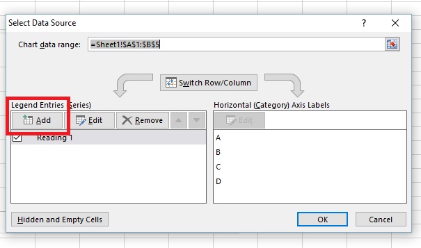

- Select the Heading from Column C for Series Name
- A2:A5 as Series X values
- C2:C5 as Series Y values


Reading 3
Repeat again for Reading 3


Now, double click on the Y-Axis and go to the Format Axis box that will appear on your right.
Select the Bar Chart Icon, and change the Axis Bounds to minimum of 40 and max of 100.


This will help make the spacing between dots more pronounced. Generally altering a Y Axis away from 0 is considered bad taste as it tends to over-pronounce differences between elements.


Now click on X-Axis and make the changes below.


Next, go to Add Chart Element in the upper right corner. Legend>Right


Here is our scatter plot


Now wait a minute. I know what you are thinking, why is my X Axis 1 – 4 and not A,B,C,D
This is a flaw in Excel. There are some third party packages you can install that will allow you to rename the X Axis in a XY Scatter plot, but not with Excel in its default state.
You can however change the chart type to a Line Chart.
Go to Ribbon > Change Chart Type
Select Line


Now your X-Axis is properly labeled


