
We are going to make some box plots in R to compare readings of 4 sensors over 1 calendar year.
To play along, download the CSV file here: sensors
HH
First, call library(HH) – if HH won’t load, you may need to install the package: R: Installing Packages
Data
First, let us import the CSV file. Using the following command, R will open a window allow you to search for your file.
SenData <- read.csv(file.choose())

Using the head() command, let’s look at our data.
What we have is monthly readings for 4 sensors (1-4)
 .
.
Our data is in tabular (often called cross-tab) format This is great for human readability, but computers don’t really like it.
Let’s use stack() to change our data into a computer friendly format.

Boxplot
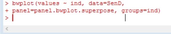
using bwplot – we are going to plot values against “ind” – months. Note we set out data to the SenD matrix

What we get is the box plot below

a box plot – or box and whisker plot – provides a graphical representation of the median as well as 1rst,2nd,3rd and 4th quartiles. Lining them up lets you see how data in each unit compare to each other.

Let’s add some color to the chart.

Notice the month are in alphabetical order. Let’s fix that.


Let’s break our time frame into quarters now.
To better understand the code
- SenD$quarter <- creates a new variable named quarter
- factor() — creates a factor
- c() – creates a vector
- rep(1,12) … – repeats 1 twelve times then 2 twelve times, etc.
- We use 12 because we have 3 months in a quarter, and 4 sensors per month 3*4 = 12


Here is some code to plot our quarters. I think if you look at the code and plot, you should be able to make out most of the additions.
**hint pch=8 turns the median line into “*”


